domestic abuse no excuse.
The reason I choose this campaign is because I have strong feelings against domestic abuse and the fact that it needs to be more spoken about and recognized by the public eye. Domestic abuse can take place anywhere anytime and to anyone so why is it that we barely speak about it? One in seven women will experience some kind of domestic abuse either by sight or by actual contact. A women will only confess domestic abuse after 17 incidents. That is if they have the help and the availability to. In this page I had a look at different styles of campaign photography campaigning domestic abuse and I have seen that they use dark coulours as we tend to use them in upset and dull moments. They also tend to use colour which are opposite on the colour wheel to create impact on the reader, and to make the poster really stand out. They also use shadow very effectively and they purposely lighten some parts of the picture to make you look at a certain part of the picture.
first impressions matter...
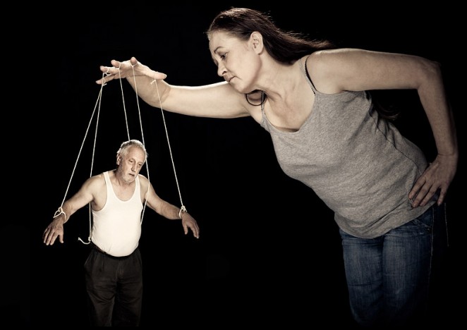
I really like this powerful picture because it shows a bold and clear message through it. It shows an old man being controlled by the women by strings like puppets. I think that there are strings attached to show that his freedom is taken away and that he needs help to cut them off. The use of shadow is very important as it shows that it is a very dull and unhappy picture , as we tend to use colours when we are happy. I think the photographer has muted the colours or has edited it to take the colours out. You can see the seriousness in their faces, and an almost tired look in the old mans face. The shadow creates an effect of domestic abuse being held behind closed doors and it is not seen by many people , I think that is a very powerful message as it says if you suffer from domestic abuse do not be afraid to come out and express yourself as help will always be there . I also like this picture because it's a female controlling a male. In most domestic abuse campaigns we often seen women getting abused by men but in the picture it is the other way around. This raises awareness that domestic abuse can happen to any gender and at anytime.
other photographers.
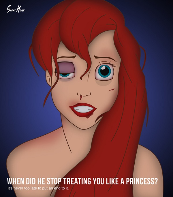
Even though this is not a photograph it is a poster I can still apply the thought in my photography. This picture is very powerful to me because I grew up watching disney princess movies and they were a huge part of my childhood. The photographer has used red against blue which are opposite colours on the colour wheel to give more impact. Little mermaids hair is a vibrant red where as in this picture is is muted to a maroon towards the edges to give it that hurt and used effect . The photographer has done a lot of editing to her face. He has given her a black eye and cut lip and a bleeding nose this all shows that she has been majorly affected by domestic abuse .This picture has also used shadows to show that it is not a subject people always talk about and that it happens in the dark where no one can see. The quote " when did he stop treating you like a princess?" is very effective as she is the little mermaid and she is known as one of the main Disney princesses . We are used to seeing them happy and cheerful and singing all the time. I think that people need to be more aware of domestic abuse and need to seek help when/if it happens and to know that help is always there. In the picture she is looking at you staring straight into your eyes . There is a little bit of white in her eye which has been edited you can see that she was crying but holding back the tears. She is also not wearing anything on her which gives the effect that her pride has been taken away and it gives a more of a dramatic effect which I think the photographer was going for. In a smaller font at the end it says " it never to late to end it" so its saying that there is always hope and that you deserve better.
my INSPIRATION.
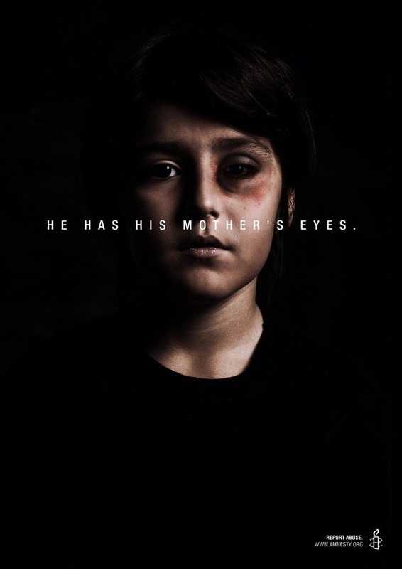
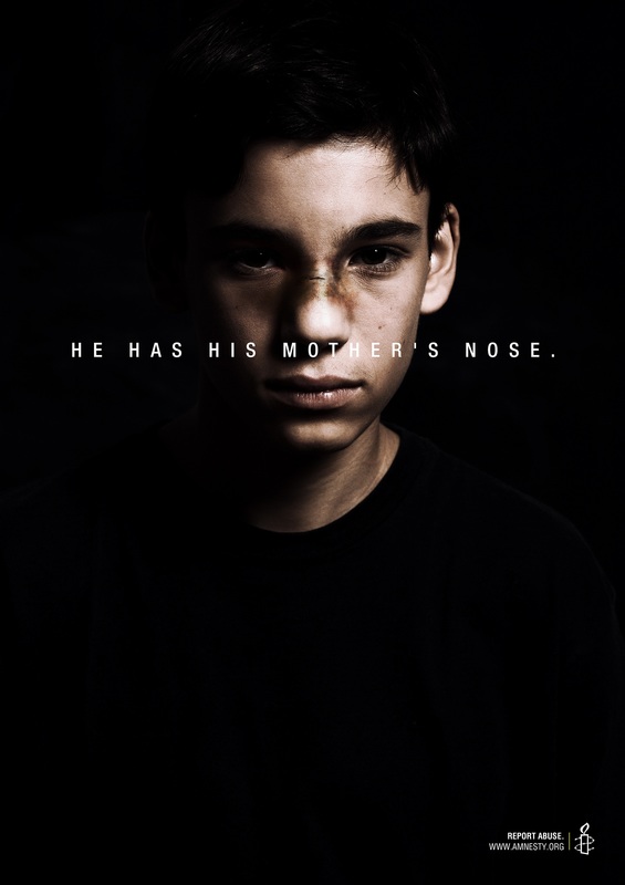
This is one of the most powerful pictures I have seen. This picture is my influence and I will try and recreate this image myself . You can see how cleverly the photographer uses light and shadow. He has put the child in a black t-shirt so it blends in with the background. Only one side of his face has light , so the light must have been given from an angle rather than in front of him so you can one see half of his face. I think this creates a big impact because it makes the picture unhappy as it has no colour. It also shows us that because of the darkness, domestic abuse usually happens behind closed doors. The photographer has given the child a black eye by using makeup and a bit of editing to make it look swollen. I would like to use this effect in my photography as well , where I create a black eye and make it look realistic . The picture has writing on it saying " he has his mothers eyes" , and because he has a swollen eye it is implying that his mother is going through domestic abuse as well. The use of the phrase " he/she has his mothers eyes" is usually used in good sense and used when a new child is born. But in this picture it has totally reversed the expression and given it a completely different meaning. The child in this picture looks like an average kid as he does not look rich or poor, and his face is common. This makes it have an even better impact and it shows that it could happen to anyone at any age and they should call for help if they need it. The writing is in white with a black background. It is a very classic yet effective way to make a message stand out as they are opposite colours on the colour wheel. The picture below is another example of the same campaign but instead of his eye its his nose and the writing changes to " he has his mothers nose" so you can clearly see a correlation between the two pictures. It also uses light and shadow effectively to create impact that domestic abuse happens behind closed doors and we can't judge people for it.
bullying CAMPAIGN
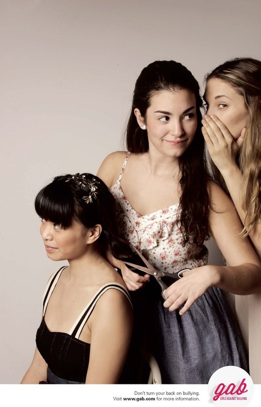
This is another campaign I looked at. This one is about bullying , in the picture you can see a persons hair being cut off and the person cutting it off seems to be her friend. I really like the way the picture , as it is really simple but can deliver a powerful message. Unlike other campaigns it dose not use dark or shadowy effects but still delivers a clear message about bullying and how bullying is not always extreme in the way of killing people or injuries, but it can also be done in simple ways like talking about someone behind there back , name calling and grouping up against someone else making them feel out powered. We see bullying everyday and yet no one stops it and as a person once said " its not the criminal we should be worried about , its the people who just stands there and watch'". I think the picture uses the rule of three as there are three girls , and one plays the innocent one who in the person who's hair is getting cut off, and we have the middle girl who is getting peer pressured from the girl on the end to cut her hair off. It uses pastel colours so it dose not hurt your eyes to look at the poster so you can look at it for a long time and analyse what actually going on. The photographer has cleverly used the expressions on each of the girls face clearly and it shows what kind of people they are, I think that is a very hard and skillful thing to do in a picture. If you are experiencing any type of bullying don't be afraid to talk to someone about it and know that help is always available.
This is another campaign I looked at. This one is about bullying , in the picture you can see a persons hair being cut off and the person cutting it off seems to be her friend. I really like the way the picture , as it is really simple but can deliver a powerful message. Unlike other campaigns it dose not use dark or shadowy effects but still delivers a clear message about bullying and how bullying is not always extreme in the way of killing people or injuries, but it can also be done in simple ways like talking about someone behind there back , name calling and grouping up against someone else making them feel out powered. We see bullying everyday and yet no one stops it and as a person once said " its not the criminal we should be worried about , its the people who just stands there and watch'". I think the picture uses the rule of three as there are three girls , and one plays the innocent one who in the person who's hair is getting cut off, and we have the middle girl who is getting peer pressured from the girl on the end to cut her hair off. It uses pastel colours so it dose not hurt your eyes to look at the poster so you can look at it for a long time and analyse what actually going on. The photographer has cleverly used the expressions on each of the girls face clearly and it shows what kind of people they are, I think that is a very hard and skillful thing to do in a picture. If you are experiencing any type of bullying don't be afraid to talk to someone about it and know that help is always available.
my turn....
scar face.
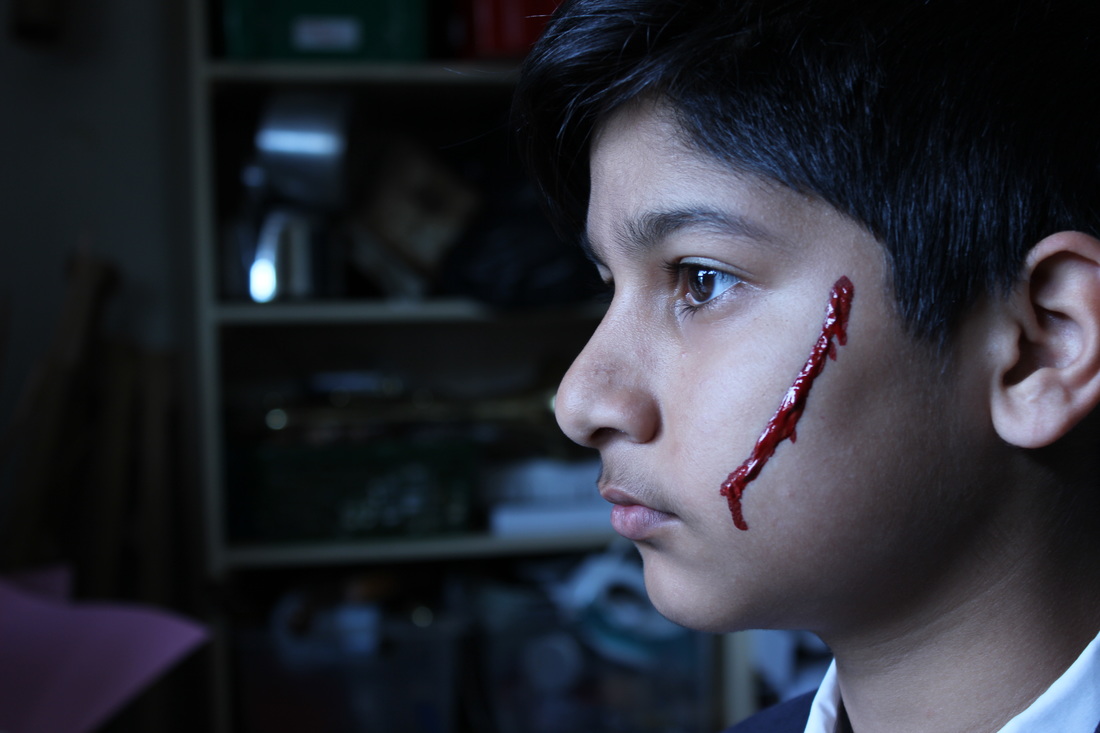
In this shoot I used a person in my class as model and put paint on him to recreate a scar on his face. I wanted it to symbioses that he is hurt and is looking out the window for hope so he can escape from this misery which he is facing at home. I tried to take the color out of his face as much as I can, by changing the aperture to -1 or -2. I also like how the light from the window falls on his face and its darker behind him to almost show that he is facing towards the light and almost escaping from all the pain and misery which he has faced. I had this idea when I was looking at campaign photography and wanted to recreated a scared face , so I went to the art department and got red acrylic paint and mixed it with some brown acrylic paint and diluted it with bit of water, then I used a very fine brush to apply the paint on his face generously so when I took the photograph you could see the shin of the blood as it trickled down his face. Then we needed a dark room with light coming in from one direction. We use the room next to the classroom and switched the lights off and took a small flash light to add light from the bottom of his face. Then we placed him in front of the window and had natural lighting on his face which gave this lost and mysterious affect. As I changed the aperture and took the color out the picture it gave a black and wight affect and as the blood is red it is opposite colors on the color wheel it helps the picture stand out and the blood really popping out of the picture.


stupidity.

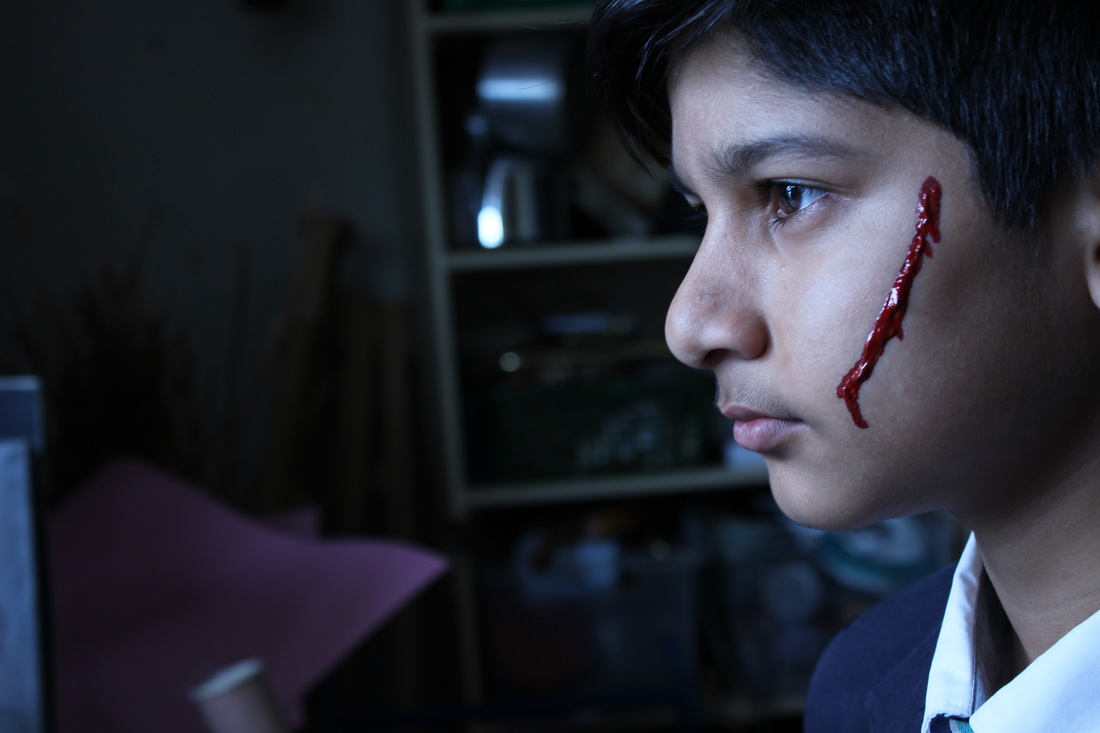
I feel like this is one of my very week photos as the shutter speed was slower as I was in a dark room so I would have needed a tripod to keep the camera still so the picture would not come out shaky and blurred. I could have changed the white balance to make the picture less yellow/ orange toned. In the picture the blood is clear that it is fake and therefore overall it is one of my worst photos. But as a wise person once said , we learn from our mistakes.
genius.
I really like this photo as it really makes the blood stand out on his face as it is dripping down from his cheek. he is looking out the window for an escape, almost as if he has left all the pain and unhappiness behind him , that's why it is dark behind him and the light from the window is on his face.. it would be even better if my model was not wearing the suit with a tie because it almost like he was dressed for school but I think It adds to the affect that he was not ready for it.
honey I'm home
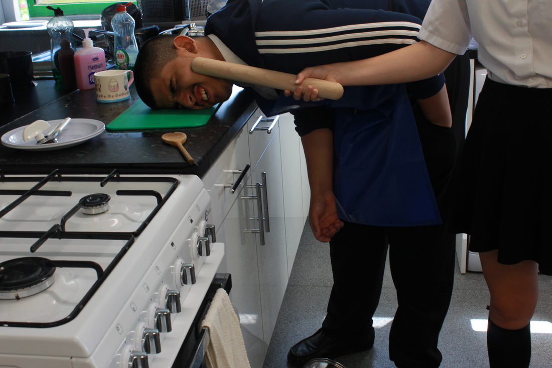
This is one of my other domestic abuse photos , it shows a man getting hit by a women which is the other way around to what the public usually see. It shows a man who was cooking dinner and the women came and hit him because he did something wrong. This shows that domestic abuse is not only by males but it is also done by females.


GENIUS.
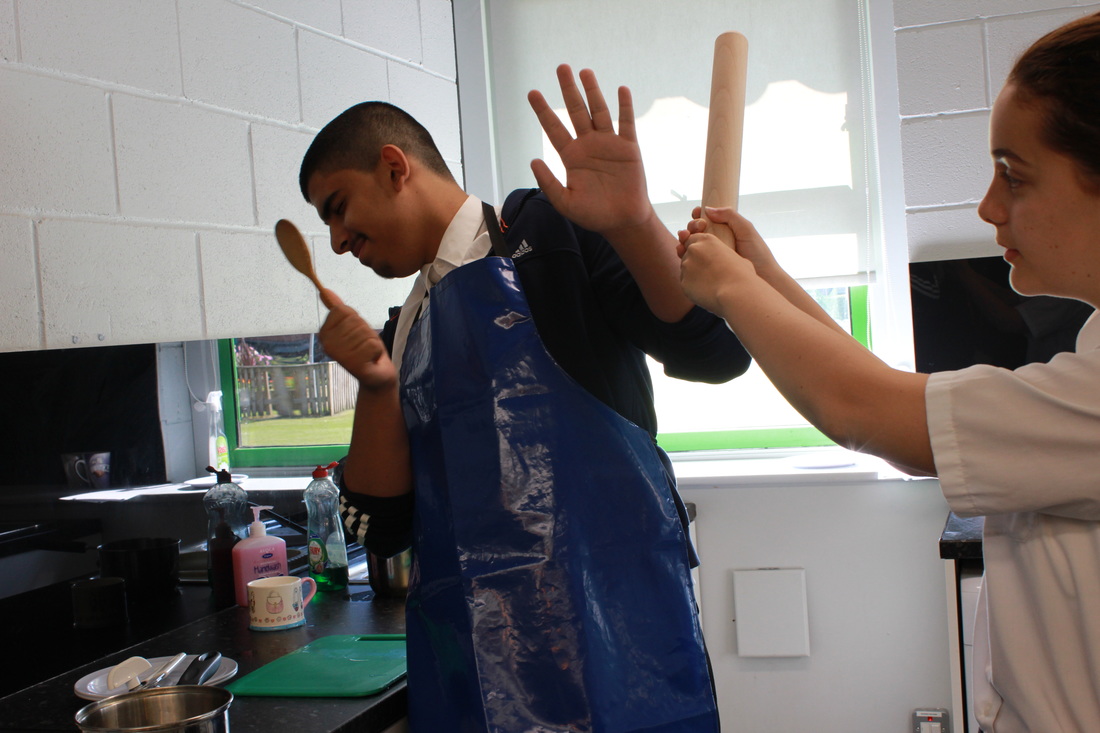
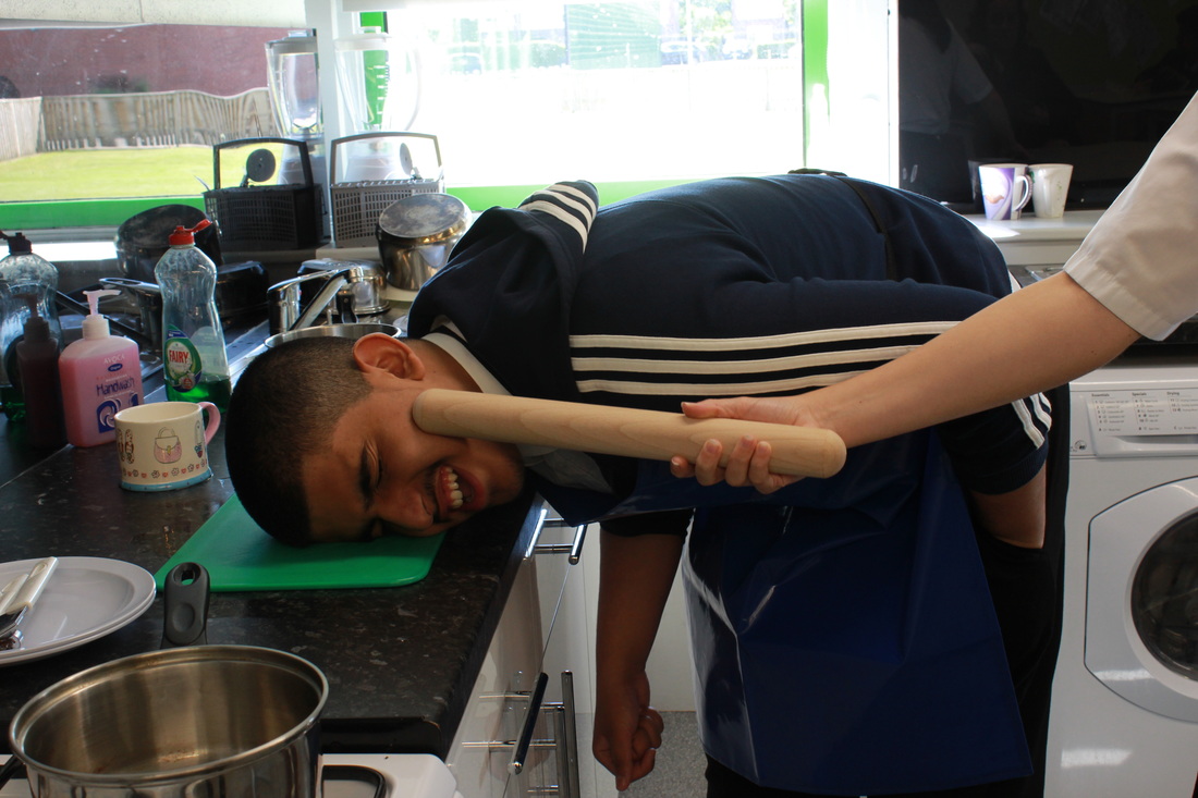
I really like this picture because of his expressions and the way the rolling pin is placed on his face, this would be better if I could put an effect on it using Photoshop and maybe make the whole theme darker. I would also crop out the window and maybe put a background of hill is to make it look like they are in the middle of nowhere. It shows that domestic abuse dose not only happen to females and that it dose not only take place at night but also in daylight. I used the theme of a kitchen as we usually expect the girl to cook and not the boy, this also plays with the theme of opposites in the shoot. I also like how all the objects in the kitchen are messy to show that the person was busy cooking and it gives it a much more realistic effect and adds motion to the whole picture a lot more. I also like how the women is using a rolling pin as it adds the effect of a real kitchen a lot more and really makes the picture come alive.
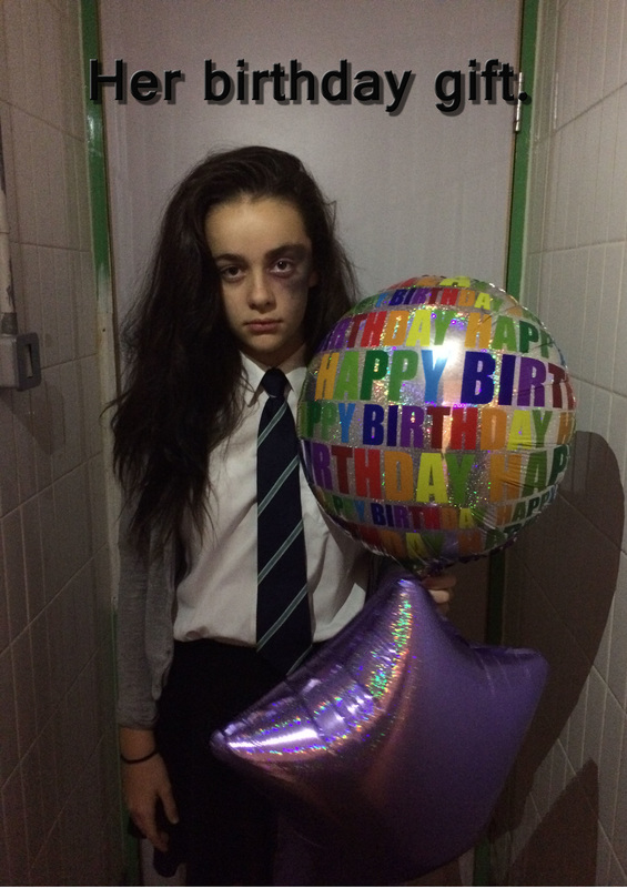
the birthday gift.
First I will need a model for this shoot, I will have to have a black background which I will get from the art department . I will also have to get make up to recreate the black eye , then using expert make up technique I will apply the make up and give my model a black eye. I will take a dark room which can be found at the bottom of the Pexa theater and use the flash light on my phone as extra lighting which will be projected on my models face. I will need to have steady hands as it will ruin the picture if I move as it will make it blurry. And I will take photos along the way. The pictures below is how I created this.
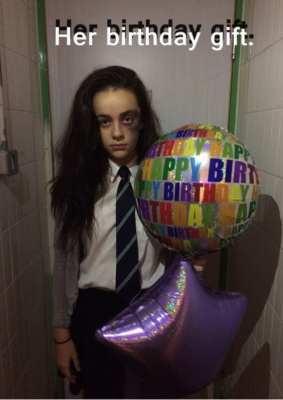
I wanted to try it with a quote "Her birthday gift" so I added it by using Photoshop, then I tried it with different colours.
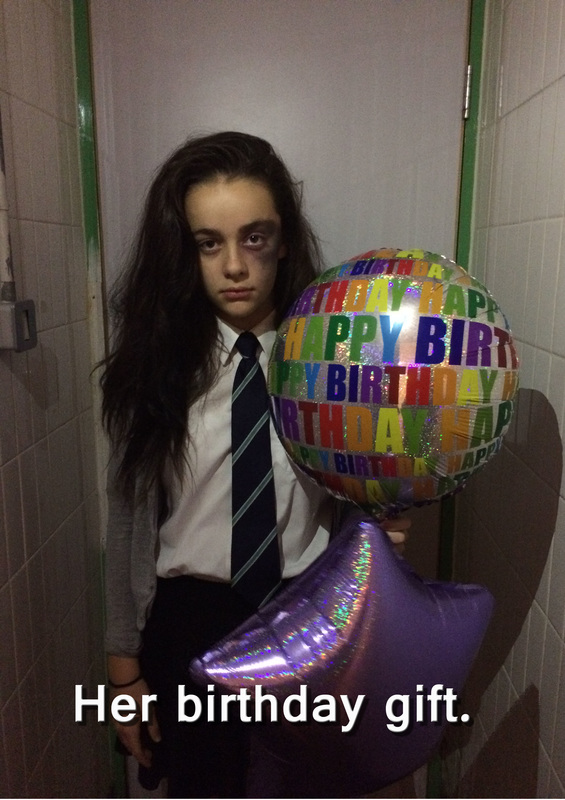
This was one that I didn't like as much because I felt the font and the colour makes it look like unprofessional.


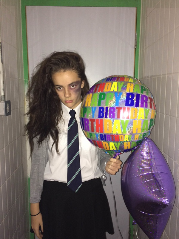
This was my final picture. I really like it because it shows a girl having a bruised eye as her birthday gift and the domestic abuse also happens to children at any time , even on their birthday. I really like the effect the shadow has on the picture as it symbolizes that domestic abuse takes place behind closed doors. I like the writing being at the bottom as it gives a more dramatic affect on the viewer and the bit of shadow that has on it as well. It would be better if I could make the background more dark using a black screen and instead of using toilet lightening, I would use a bulb, either straight from the bulb or make it diffused using a light umbrella. Maybe I could have used a silver screen so the light reflected of it giving a more dramatic impact on the viewer. I would also use a yellow face paint in the corner of her eye to make it more realistic. I really like the way her hair falls on her shoulder too because it looks messy and adds to the effect of the photo.
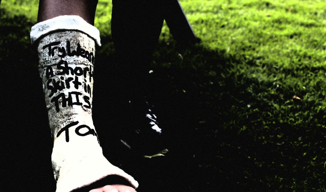
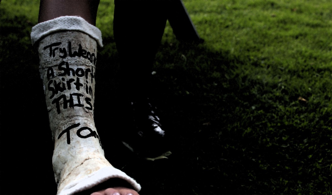
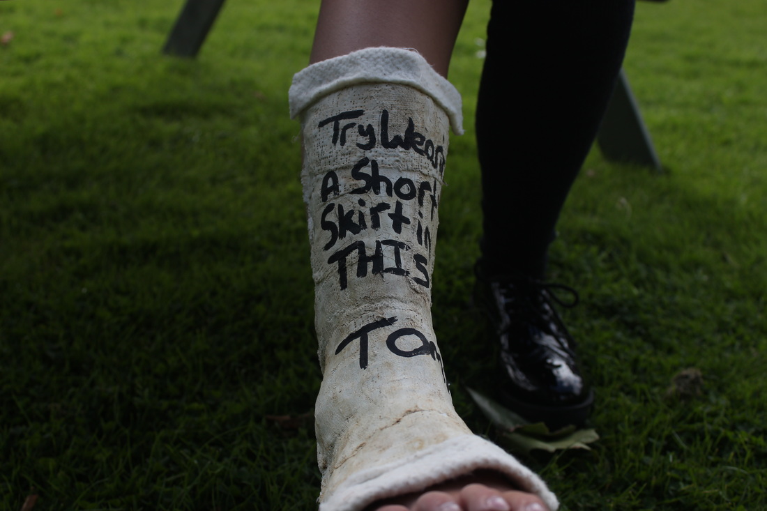
broken leg.
In my final shoot for DOMESTIC ABUSE NO EXCUSE I wanted to have a girl in a cast and the cast saying " try wearing a shorts skirts in this " and then a boys name. It would show that her husband or partner broke her leg as he didn't want her to go out with her friends in short dresses. The cast needs to look old and worn out with a bit of padding around the edges. The cast is extremely hard when it is dry , so we cant do a cast all over the foot otherwise she wouldn't be able to get it off. So I needed to go to the art department to see how it would be possible to do the shoot or if I cant do the shoot.
the process...
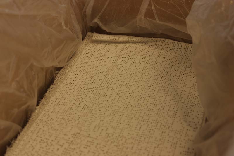
First we got some Modroc , I used this by putting it in warm water to activated it and then putting it on my leg. It dries and becomes very hard so it was perfect to use for the cast. We did the cast on Friday so it would have enough time to dry over the weekend.
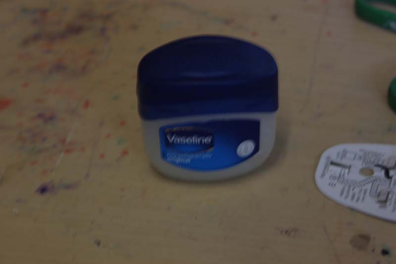
I had to put Vaseline on my leg so when I took the cast off it didn't rip my hair out.
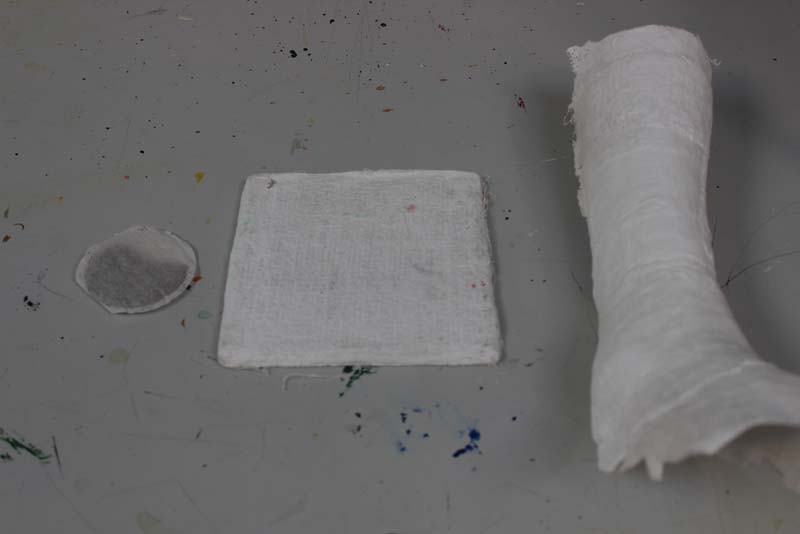
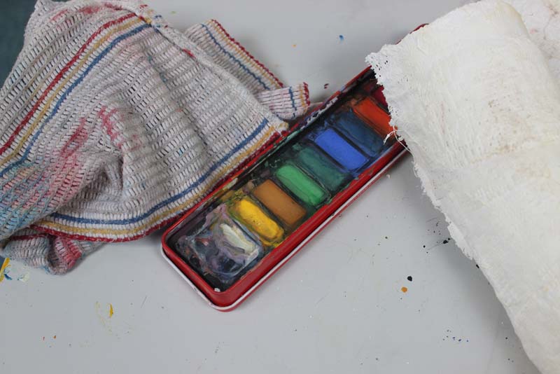
After the cast dried over the weekend it was rock hard. So I had time to paint it so it looked worn out. I had a testing palate so I could see what thing to use on it .
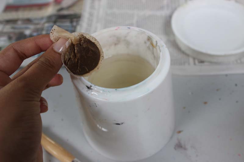
I chose to put a layer of tea stains on the cast first so it gave it that old look and let that dry off first for 10 minutes.
Then I used a bit of chalk but one of the colours was too dark and one was too yellow so I had to mix both of them between my fingers and almost smudge them onto the cast.
Paint didn't really work as it was simply to dark and harsh for the cast, but a bit of the white worked for giving it highlights and on the places that wouldn't have got thatt dirty.
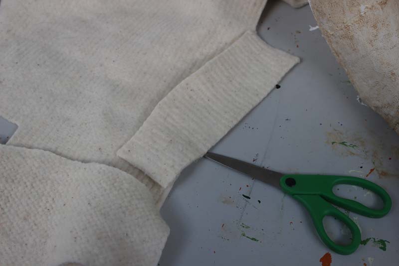
I had to do some research on casts and have a look at the little details which were out on it. I had to give it padding on the top and the bottom as they would not be sharp . I used a bit of material which look like padding and cut it up so it fit the shape of the cast.
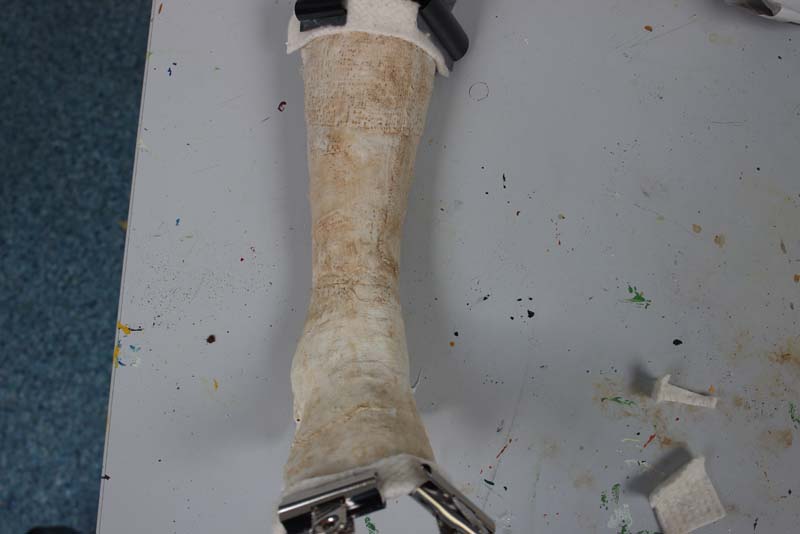
I then left it to dry with two clips on both ends so it would stay in place.
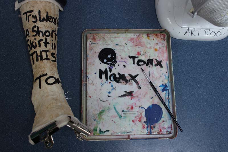
At the end I had to write the message "try wearing a short skirt in this" with a guys name . In that picture I was deciding between the names Max or Tom. At the end I went for Tom as I preferred the way it looked.


actual shoot...


different location...
I wanted to get a different background and lighting so it showed a different side of the cast.


stupidity.

I didn't like this picture because it is over exposed, so there id too much light. You can also see the it is not a real cast because of the end of it where the cast breaks off.

It shows parts of her calf which pops put of then cast. So it shown that the cast is not real.
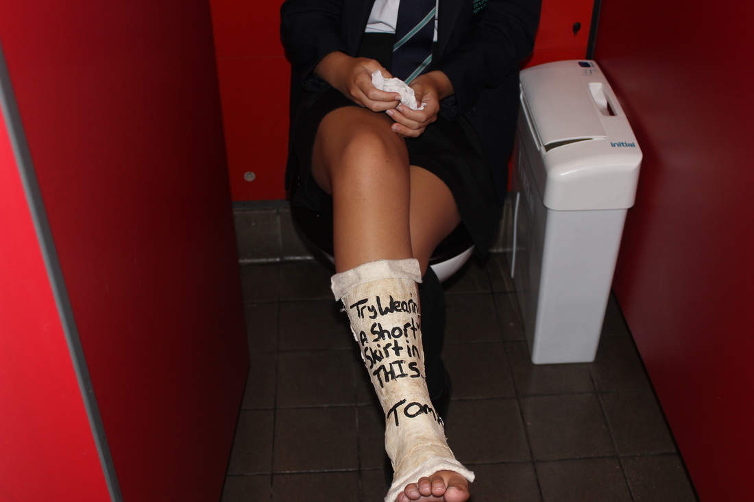
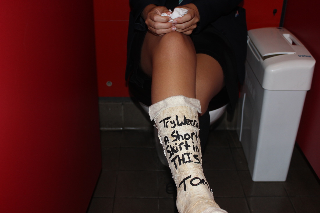
genius.
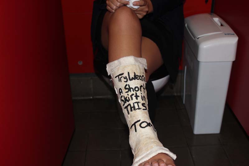
This is one of my favourite photos because I really like the effect the flash has on it . She is sat on the toilet as you can tell from the background and the tissue in her hand to also add to the effect that she was crying. It has a high depth of field so most things are in focus and the aperture is on zero so it is clear ands you can see the writing on the cast.
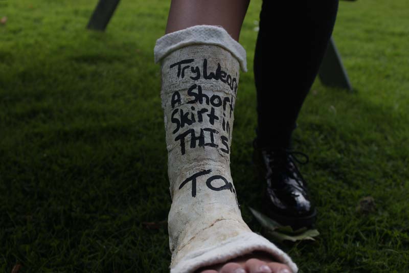
I really like this picture because I made the aperture low than it should be, this created a dark and mysterious effect. I also like how the grass is not in focus or the other leg, so the viewers concentration automatically goes to the writing on the cast.
editing.

I wanted to change some of the lighting, so I used Photoshop and made the background much darker so it stood out more.
|
|
|
I had a play around with the darkness of the picture on photo booth, on some it was too dark and it was drowning the light in the picture but some of them worked well and made the writing look darker. Which is the effect I am going for.
mistakes happen...
I forgot that even though I wrote ' try wearing a short skirt in this' in my last shoot I took the picture with my model wearing a short skirt. So I retook the picture outside but with my model wearing pants so it didn't go against the picture.


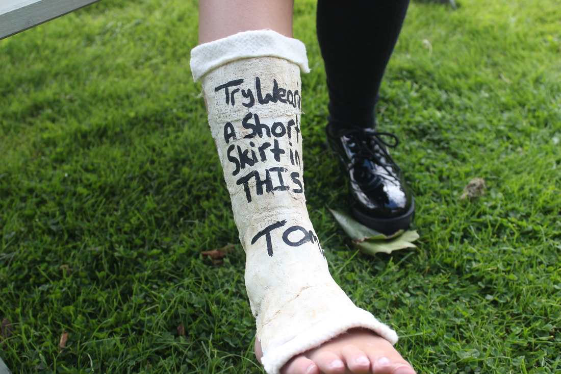
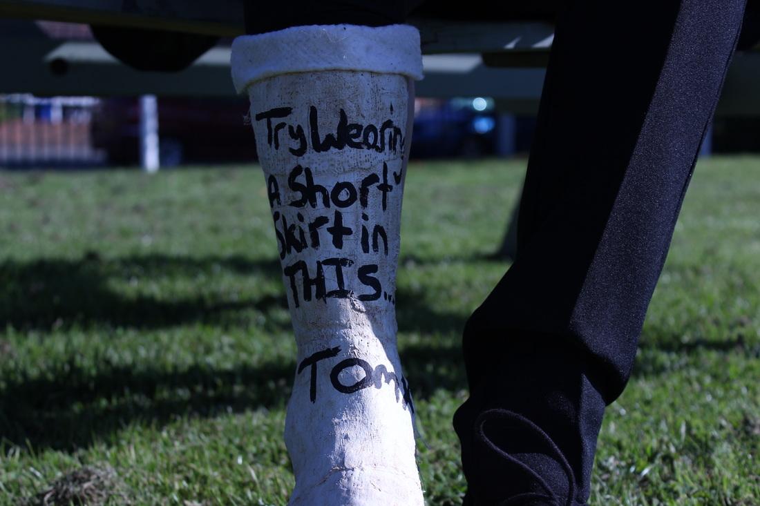
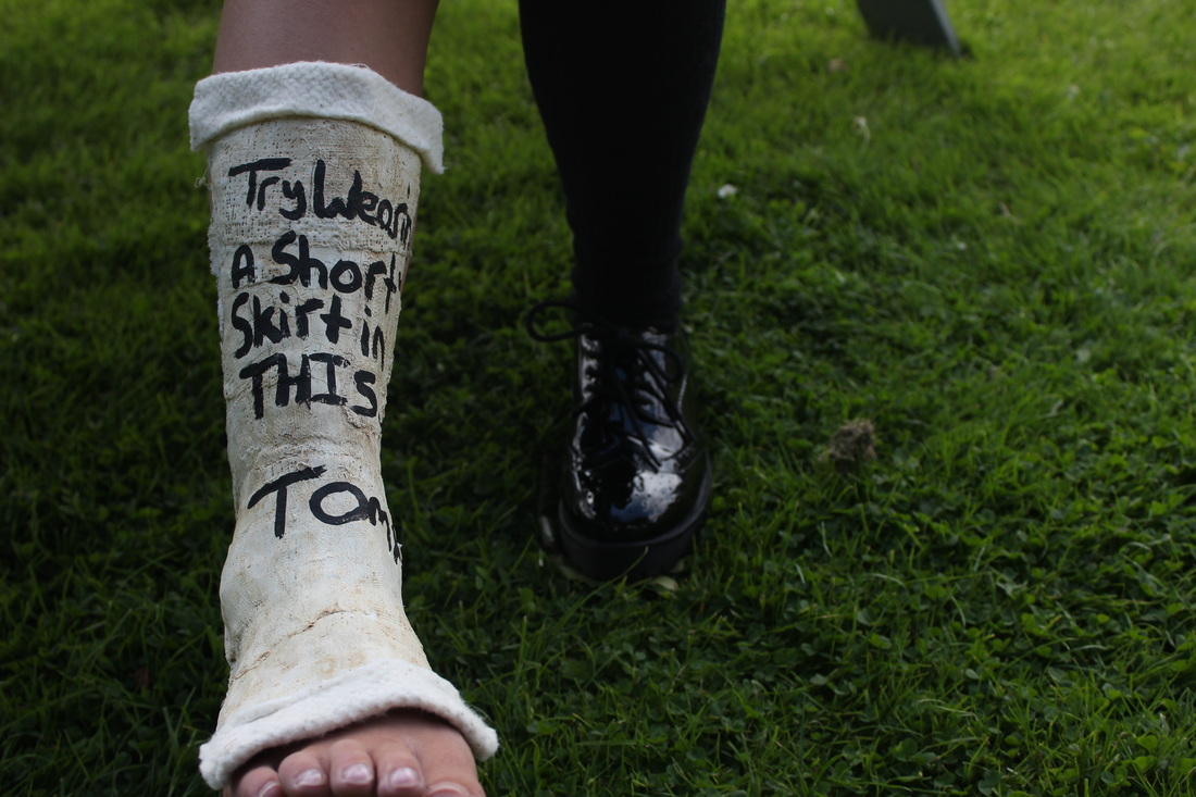
I really like this picture as the lighting is perfect because the aperture is on zero. The focus point is on the cast so the writing on the cast it easy to read and catches the views eye immediately. It has a medium depth of field so the grass in the background is not in focus. I have really enjoyed doing campaign photography because I feel like it has allowed me to experiment with Photoshop a lot so I can sharpen some pictures like this one. I think I have taken pictures that represent my theme well as I have shown domestic abuse and how it can change in genders.
