SLINKACHU...
Slinkachu started in 2006 , it has come a long way since then. It is the art in which you remodel a real scene into miniature size. It usually has humour or a powerful message within the image and it should tell a meaningful story. I enjoy looking at the work of Slinkachu because it usually has a deeper meaning to it and clear thought and attention which has been paid. After looking at some of his work I wanted to attempt replicating and doing some of the work myself. It caught my attention that it needs real creative ideas and some deeper thinking, so I spent some time and came up with some ideas of my own and had a mental plan as to what I wanted to do next. I would try to find common everyday situations like the artist himself and put a few miniature models onto it and turn it into a very creative and new picture, even if it meant burning myself by using a hot glue gun or having to push myself to my limits for one picture. In the end it was all worth it as I created my hot air balloon with ideas from myself ( I am taking all credit ) and with the help of my fellow class mates to hold it still as the wind blew at the exact moment I wanted to take a picture , it turned out well and I am proud of my work. You will be able to see it soon but first here is a few of the stages I went through to show my improvements.
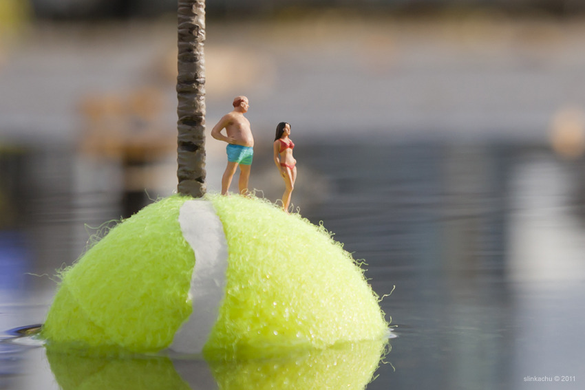
I like this picture it is really creative. It shows that even the most common objects can make an impacting picture eg- the podium is a tennis ball which is floating on the water. It reminds me of a hot summer beach and a perfect holiday with my loved ones. I really like the way the sun falls on the models and the tennis ball gives it a shining feeling almost lighting up the picture. I would like to know how he kept the tennis ball still and stopped it from turning in the water. I assume it was by the help of a dear friend or a peace of invisible string but my question will always be unanswered unless I ever have the opportunity to meet this creative genius, which I hope I do in the following years of my life time.
more examples of slinkachu...


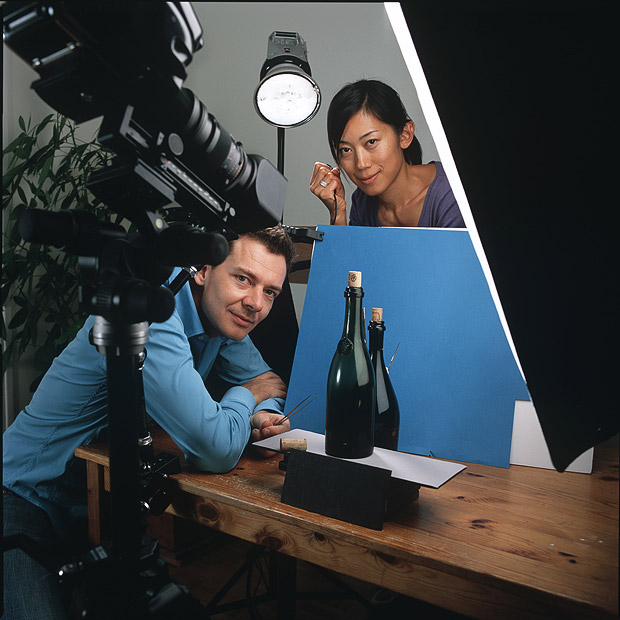
pierre javelle and akiko ida...
This artist does similar photos to slinkachu but they usually involve food. They take small pieces of food and put it into a context which has humour or include it into a story which has a meaning . I love food and taking a picture of it is almost a perfect match. They use foods and there texture in such a creative way that it is a true form of art. They can turn any food into a creative and unique picture , just like Slinkchu it would be a dream to meet them. I would love to see their minds in process and see them working on their next master piece and i'd love to be a part of it.

I like this picture because it takes an ordinary food and makes it into something imaginative. This one takes a watermelon and puts construction workers on it and makes it look like they are working on it by positioning the watermelon seeds in a clever manner. I think that this was a very imaginative idea and wanted to attempt doing something similar myself . I like the background being blue too to give an idea of a hot summers day and giving the picture daylight , it would also look good with a black background to show that they are working over time. I have tried to create that in my shoot "working over time" by using the tungsten white balance and being creative in the process.
the artists
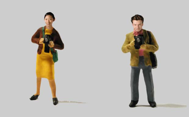
In my opinion these are the two artists who designed the most interesting images you will ever see in tiny projects , they add humour and convey messages through their pictures that have a deeper meaning. Underneath is a picture of a slinkachu model but it is specifically designed to them. It has there faces on and they are both holding a camera as they are both exceptional photographers.
some of ther work...


my favourite
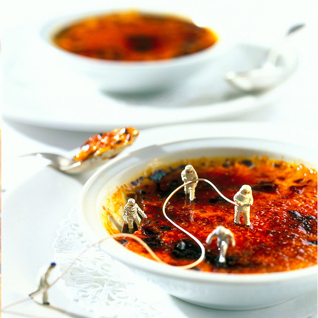
I really like this picture because it shows outer space being portrayed by the cremebrulé and it shows team work. It also has a small depth of field so the background is blurred and the focus point is on the miniature people. It has a very clear message, I love the creativeness in it and it looks good with a white background but in my opinion it would look even better with a black background. Using a black background it would have shown space and you could have added small lights to represent stars or other planets in the galaxy as the models are in space costumes. However, as it is on a plate it would have looked better if there were sugar cubes to represent a cup of tea or a napkin to show its a table for food.
not one of my FAVOURITES
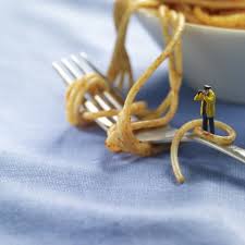
I don't really like this picture because it doesn't show a clear message. In terms of the camera it has the right focus point and depth of field but it doesn't show a story or have a clear message like the other pictures do. I think it doesn't deliver a clear message because it could be anything , it could be a person looking into a telescope or it could be a person with binoculars looking at something or spying on someone, even if, why would there be noodles, it could be anything but they uses noodles. I could just be missing the inner depth of the picture but in my opinion it is one of there weakest photographs as it doesn't deliver a message of any kind or portray any humour.
my first attempt...
COLOuRFUL trail


stupidity...
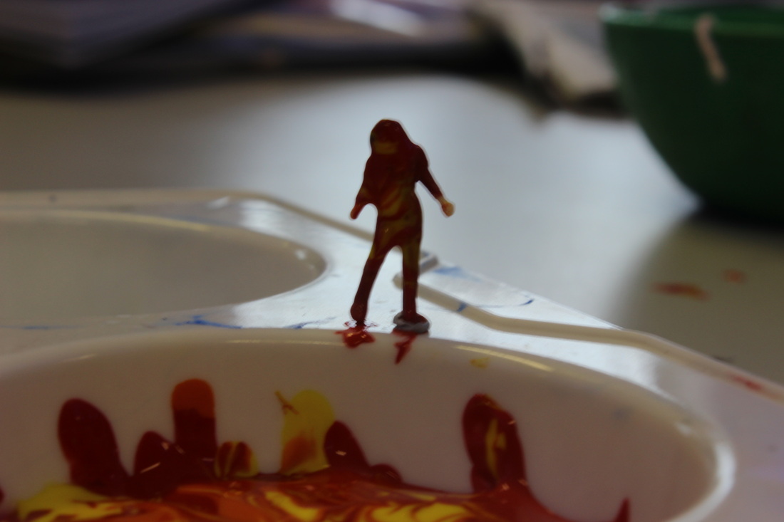
I don't like this picture at all because it hasn't got the correct exposure ( 0-3) and it is out of focus so it is blurred. You can see the blue tack on the models legs therefore it doesn't look realistic. Also being able to see the blue tack is very unprofessional and makes it book very unrealistic. I used a mixture of paint thinking that it would look good as it could represent fire and a "girl on fire" like in the hunger games but it just looks stupid and very messy. I don't really know why my friend didn't stop me from taking this picture because it is shameful.
genius..
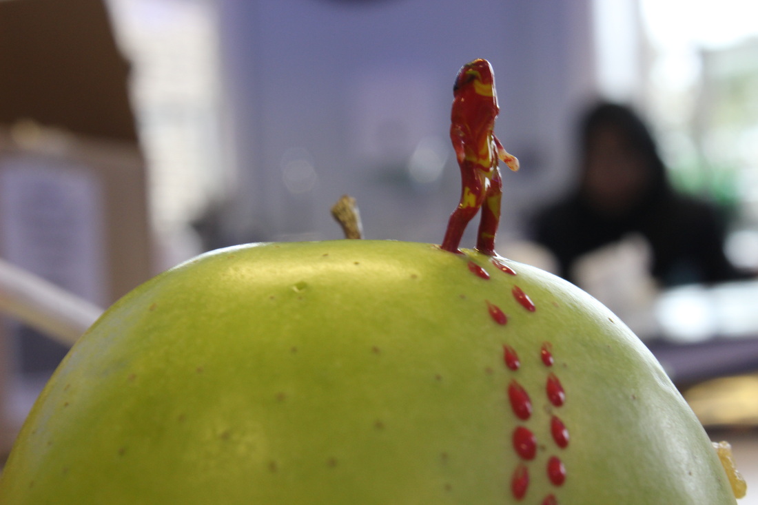
I like this picture because the focus point is correct and it has a small depth of field so the back is blurred out. It is on the correct aperture. This idea came from looking at the artist and trying to copy or should I say attempt to copy his work. It shows a person walking from the bottom of the apple to the top as if they have accomplished something and I like the way the light falls on the paint which represents the footsteps as it gives a shine on the red paint.
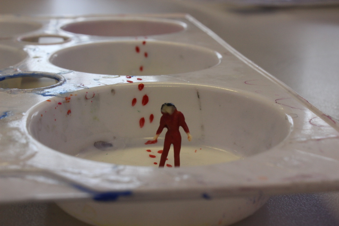
I like this picture because I think it has more meaning to it than the first one and even though the focus point is not on the miniature person I think that it looks good on the picture. It shows a woman who has come a long way from the start of the paint pot to here. It could symbolise how women fought for their rights and that's why I have made her footsteps red. It looks like she has come a long way and is now in a better place.
paint brush man
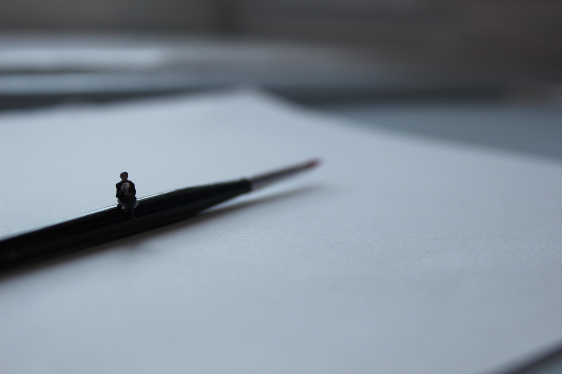


I take lots of pictures of the same thing because it takes 100 pictures to get 1-10 good pictures -wise words from my teacher.
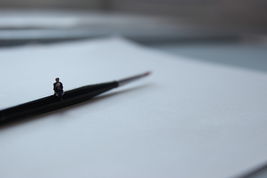
I like this picture because it has the right focus point and a small depth of field. It shows a man reading a news paper on a paint brush. This idea come to me when I was in the art room talking to my friend and looking at the paintbrush in her hand and I thought to use it for my photo shoot , and here it is. I like the effect the light from the window has on the picture as it looks like there is a spotlight on the man even though it is natural lighting. It has an unfocused background as it has a small depth of field so you can't see the tip of the paintbrush. If I added writing to the paper in front maybe a quote from a famous book or just an inspirational quote in pencil or paint it would have looked better and could have given the picture a whole new perspective. If I put the aperture just a bit higher to let more light into the lens then the mini person could have been seen more clearly and the light coming from the window makes it look darker even though the aperture might be perfect on 0.
cold winter nights
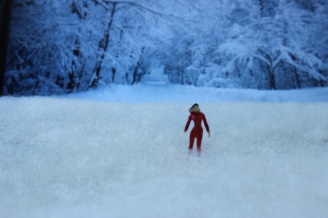
I used an iPad for the background of a snowy path way so it gave the picture more depth to show a cold winters night. I used a soft cotton material for the base from the art room which gave the effect of snow . I had to change the white balance so it gives the effect of chilliness and frost because without changing the white balance the cotton was a totally different colour to the iPad background and to be fair it looked stupid.


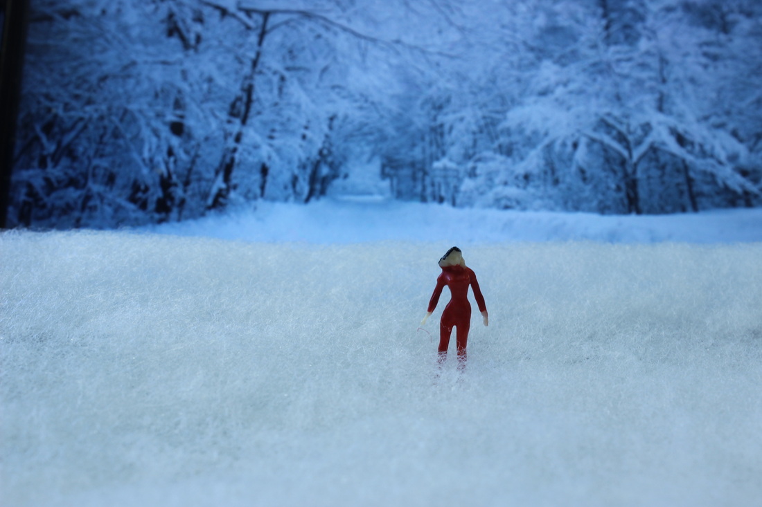
I like this picture because it gives the effect of snow on a winters night. It has the right focus point and a small depth of field so it is not blurry and you can see the background. This idea came to me when it was nearly Christmas and all everyone could think about was snow and I really wanted snow for my photo shoot but I could not rely on the weather so I had to make do with what I found in the art room. This picture could be better if there was a lamp in it then it would possibly give the effect of Narnia and it would have appeared to have a deeper meaning. It would also be better if there were two slinkachu models , then I could have created a scene where they both are looking at each other. Also if some snow was on the mini models, or on her coat, or she could be carrying an umbrella with little snow flakes on it this would have made a better image . Over all I do like this picture as it isn't obvious how I created the background and it looks like the background mixes with the "snow" wool giving it a cold and frosty effect and that is the effect I was going for.
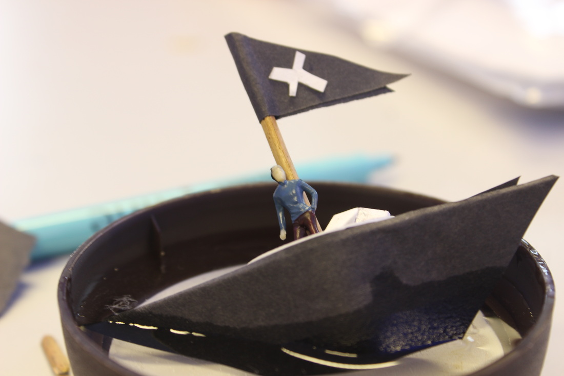
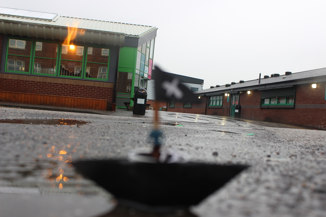
mighty pirate ship
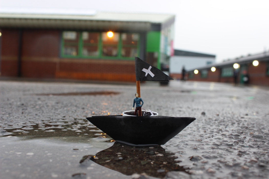
I attempted to make a pirate ship and make it float on water. I used a prit stick top as the base and used black paper to recreate parts of the ship. eg- flag and sides . I also used a stick as the pole to give it stability. In the picture you can see the reflection of the pirate ship which makes it look like it is floating but actually it's just standing on the water as it is very shallow and the boat didn't float no matter how hard I tried. I understood the artists concept and after making the boat and taking the picture I left it there to see how people would react to it in a social environment, in this case break at school. Unfortunately it only lasted for 1-2 minutes because a person chose to see it, give it attention , and then felt that he had the power to destroy it not knowing how much effort had been put into creating it, however he did not care, he kicked it using his dirty foot and then laughed with his friend. This makes us think how low society has become and the many people can't handle having power. After this horrific incident I stopped putting the models which I had put my blood and sweat into on display for the public to just destroy.


stupidity...
This is my worst picture because the object is out of focus which makes it blurry and you cant see the main person. The cameras focus point is on the background as you can see the bin in the background. This could be because I was kneeling on the ground and the floor was hard and I was wearing tights so my hand must have shaked and caused me to take this shaming picture.
genius...
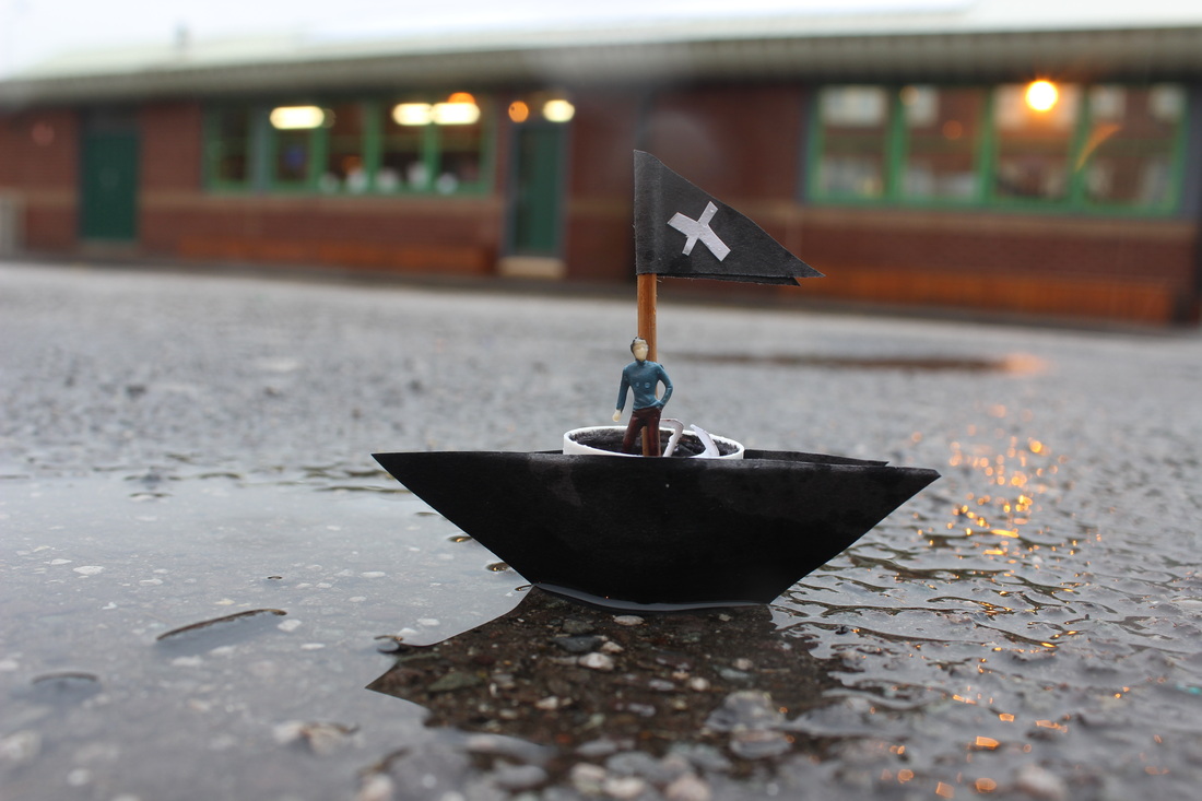
I like this picture because the object is in focus and the aperture is just right and I like the reflection on the water of the boat. You can see the droplets on the mini model which shows that it was raining and that's the effect I was going for as it is a pirate ship. It could be better if you couldn't see the white top of the glue stick as I used it as the base so if I made the paper a bit higher I wouldn't have made that mistake and maybe if I could add another person in the ship it will look more like a team and symbolises team work but I only took one Slinkachu. This idea came to me when it was raining outside and I saw the lid of the glue stick on the floor next to my table and the idea shot into my head.
working over time
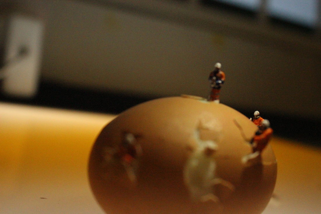
This picture shows men working on an egg. I have taken many photos to get the right one and it took a long time and there wasn't enough lighting and we used an iPhone torch from the top to create shadow . I used a light box to create light from the bottom of the egg so it gave it a sun setting look.


stupidity.
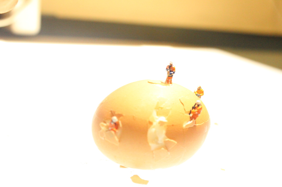
I dont like this photograph because it is over exposed so you cant see what is happening in the picture clearly. I don't like the angle because it makes it look unprofessional. This amazing idea came from an inspiring artist Pierre Javelle and Akiko ida and I replicated it using an egg which I had to boil myself. I burnt myself in the process.
genius.
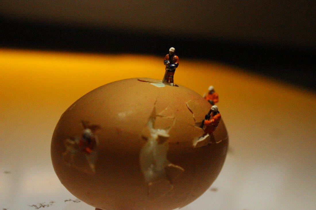
I like this picture because I changed the white balance so it gave it the effect of a sunset and the workers working over time. The focus point is also on the middle person which gives it a misty look. I also wanted to do this with other foods instead of using an egg but I felt that it best suited the context of the builders and was more avaliabe as eggs don't go bad as quickly as cake . The idea came to me as I wanted something you could crack and was easily available. I really like the background as it looks like a sunset as it has the orange tone to it and it is focused on one person so it makes it look like he is the leader but it could deliver a message saying if you work had you get results. It would be better if I had a miniature crane to add to the context or tall skyscrapers in the background to make it look more american but I couldn't make all of that and overall I am proud of this picture.
the hot air BALLOON
This was my final piece on slinkachu in which I wanted to make a hot air balloon. At first I took the top of a wine bottle and thought of using it as a base but then it took me a few days of thinking what to use for the balloon as it would be hard to find a balloon which I could use as it is a very small model. After a lot of thinking I got the amazing idea of using a light bulb , I think this was really creative as a light bulb symbolises that one idea can take you very far. So I had to get in the art room and ask some teachers to let me use there equipment for making the hot air balloon. I took string and cut it into the right lengths and used a mixture of PVA glue and water on the string to harden it. Then I took a hot glue gun to stick it on to the top of the wine bottle , burning my finger in the process several times. Then I had to attach the string to the actual light bulb taken out of my bed room and this wasn't very easy as it was hard to get all of it the same length . Then I had to take string to cover the glue so it looked neat and had to color it in. All of my supplies came from the art room with the help of Ms Ellis ( art teacher ). At the end we had to attach some sort of invisible string to see if it floated in the air and we used a very thin silver string so it wouldn't be noticed by the camera. The hot air balloon then floated in the air with two slinkachu models attached to the bottom of it . The following pictures are of me making the hot air balloon and then taking pictures with it with the good pictures and bad pictures.


stupidity.


There are a few reasons why I don't like these pictures. They are either not in focus there aperture is not right or I have completely used the wrong white balance. It was very hard to keep the hot air balloon still as the wind was blowing causing it to move around a lot so it was even harder to get the right angle of the miniature models. So I needed someone to help me with holding the model and Ryan ( my class mate) helped me later to keep it still and the the following pictures came out better as they were out side on the grass.
genius .
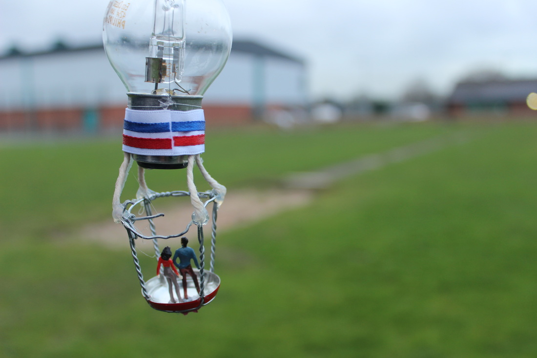
I feel like this is my best picture because the focus point is on the little people and it has a small depth of field so the background is out of focus.This is one of my favorite pictures as it shows that all the hard work I have put in paid off with this amazing picture and I feel like it shows an idea ( the light bulb ) can take you very far and all you need to do is go with that idea until your idea becomes a reality and that's what the hot air balloon represents .
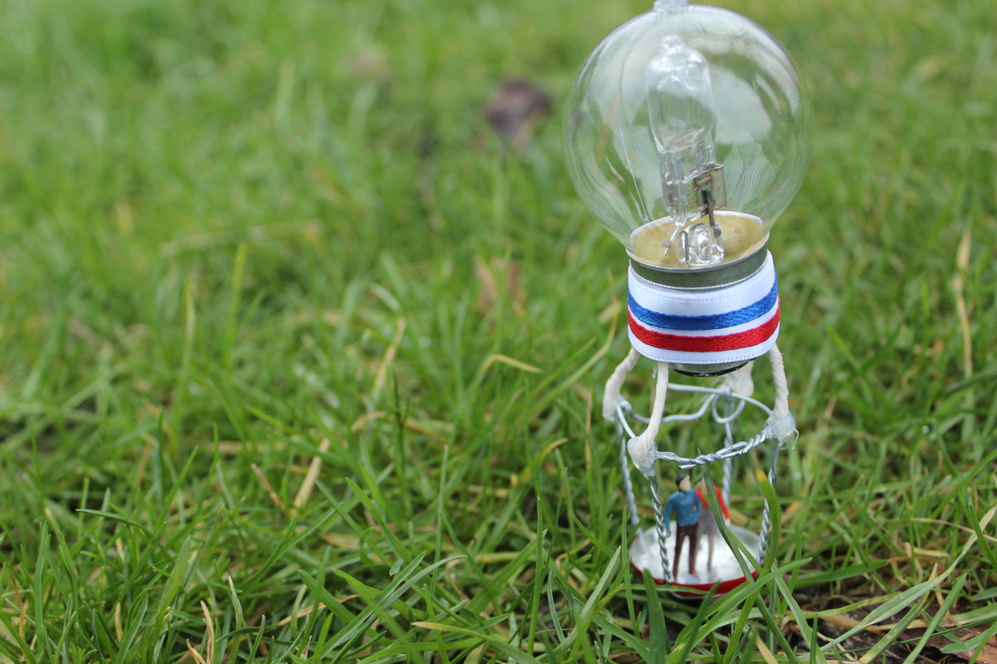
This is my final piece on slinkachu, and it is the hot air balloon. It is made of a light bulb and the top of a wine bottle and the stands are made by string hardened by glue. I have learnt a lot throughout this project and personally loved making little models for a picture and you can clearly see an improvement. I am very proud of what my final peace is and how much thought has gone into it.
