THE POWER OF THE MOBILE...
Mobile photography is the art of taking pictures just with a phone no fancy equipment or big lights as heavy cameras, its just simply with one device which is that small that it can fit in your pocket. The reason I love mobile photography is that you can capture a moment at any time and anywhere, no matter if it as big as a landscape or as small as a pebble as long as you have a mobile and you imagination you can make the photograph to be whatever you want it to be. Below I tried out a few apps which I downloaded on my mobile before taking any pictures, they are all editing apps as they can put filters and add effects to the photo just by a few taps on a screen.
WHITAGRAM...
The app is called whitagram, it is an editing app in which you can add filters to pictures, you can change its brightness and contrast, you can add boarders and even blur or focus the picture. The product is very user friendly and you have a wide range of effects to choose from, my favourite affect is the Clyde effect and it is the effect I put of the picture. The only fault is that is isn't very sensitive, so it is very hard to make precise changes. Overall I really like the app and it would recommend it to any one who wants to edit photos quickly and easily.
RETRICA...
This apps name is Retrica, this is also an editing app but you can only use filters on this one. It isn't very easy to use because its glitches in the middle and has lot of advertisements. I also do not like how it says Retrica and the end of the picture. I would recommend this to less people compared to Whiagram because I feel that it works less smoothly. Overall it is a good app except the name of the app used comes up on the picture.
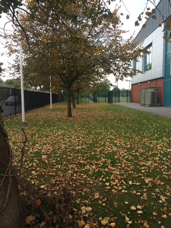
color splurge...
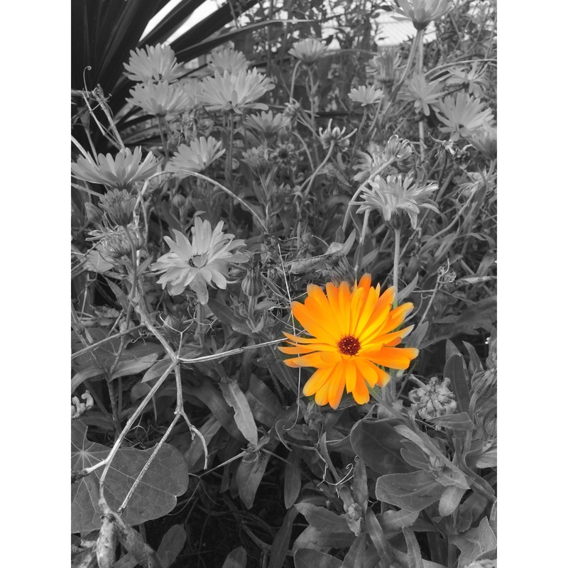
This app is called colour splurge , it is also an editing app but it lets you add colour to the pictures and make everything else black and white. This makes the object which has colour stand out much more and it becomes the focus point of the picture. I think that the app is really easy to use and has a undo button incase you do something wrong. But I found it hard to make sure the colour was in between the lines as there was no narrow colour which made it hard to make precise changes. I would recommend this app to a lot of people who just want to add colour to a picture butnot to anyone who wants it to be in detail. Overall it is a good app because it does its job.
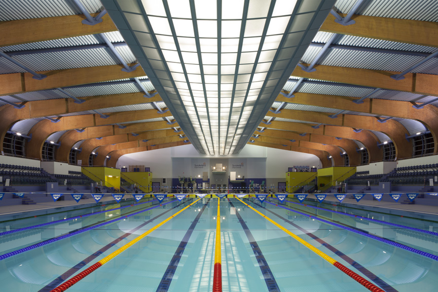
steve mayes...
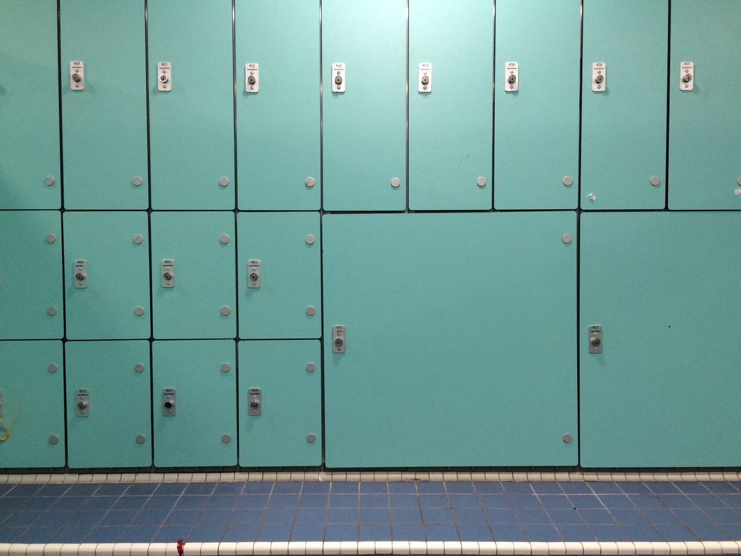
Steve Mayes is a mobile photographer who takes common objects or buildings and makes them eye caching. I really like how he makes a photograph simple yet perfect. I feel like he likes to use light in various ways for example in the sky coming from the sun, or light in a swimming changing room or even light on a poolside. I feel like most of his pictures are symmetrical and uses the rule of three. His focus point in all pictures is in the middle unlike some other mobile photographers this technique makes each of his pictures simple but they all have perfection.
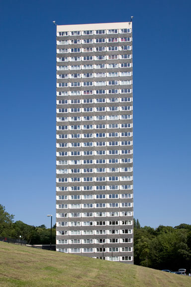
I really like this picture as it give the perspective of how small we actually are compared to buildings roads towns and cites. It makes me think about other areas and how fortunate I am to be in a place where there are no wars and gives me time to look at the bigger picture. I really like how he has used the clear blue sky in the background and keeping the building in the middle and the focus point also being in the middle. I also like the large depth of field allowing me to see the trees in the background.
roger clay...
Roger Clay is also another mobile photographer but most of his photos are in black and white. I think this gives an effect of the picture being old as they didn't have colour photographs back in the day. His photos don't really follow a pattern as their focus point is not in the middle or to the left or right. I think he captures motion really well as in all of them there is something moving for example the cat would be peering out to see whats on top of it. Roger uses a high depth of field in all of his photographs, this means that most things if not everything is in focus in the picture.
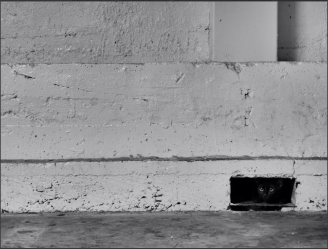
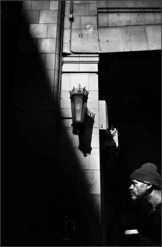
I really like this picture as its uses lighting very well. One side of the picture is pure darkness and the other side is only partially dark excepting the man walking as the picture captures motion. The focus point of the picture is the lamp in the middle which has an ancient design on it. I really like how the picture is in black and white and has a large depth of field so everything is in focus.
Robert paul jansen...

Robert Paul Jansen is another mobile photographer. I really like the angles he uses in his photographs. He uses birds eye view and worms eye view to get really interesting angles on objects such as stairs or objects on a table. I think he takes pictures of objects that have a lot of shape to them and are very defined such as the stair case. I think being a mobile photographer you always have camera on you to capture any moment at any time
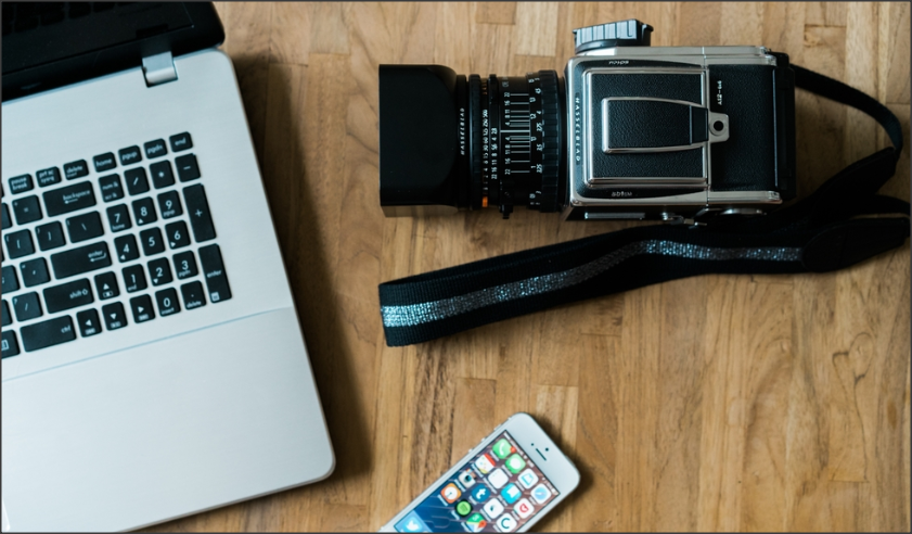
I really like this picture because of how simple it is. It uses such generic objects such as a phone and uses a birds eye view. Most things are in focus so it should have a large depth of field. It makes it look really simplistic but I feel like it has more meaning to it than just a picture. I feel like it shows different technologies as in a laptop a camera or even a phone. It might even show that he takes pictures and uploads them onto a his blog using the laptop.
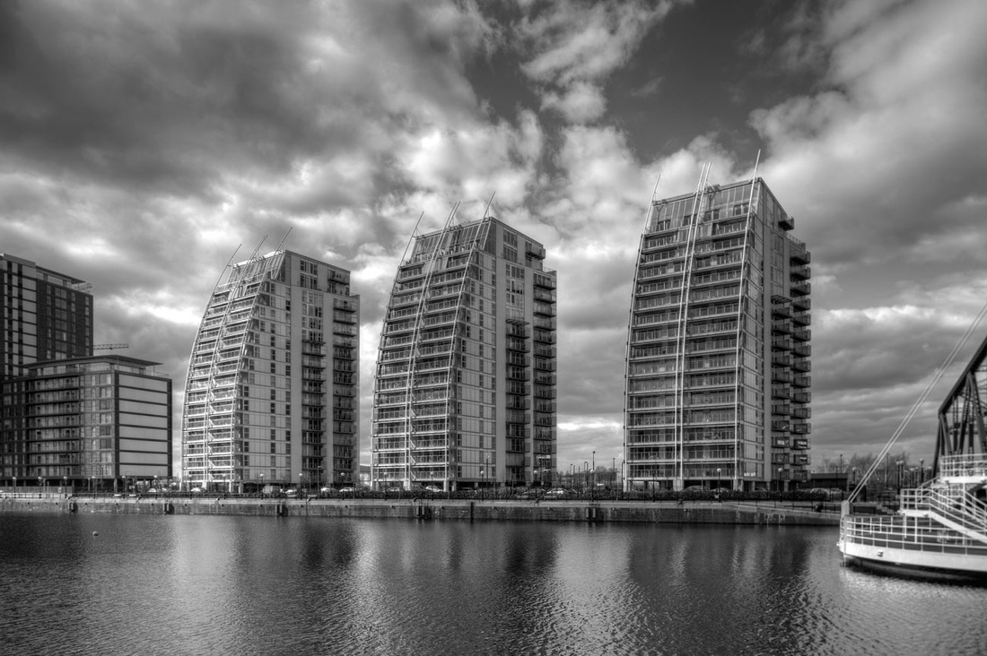
This is one of Steve Mayes's photographs and I wanted to try and replicate it.
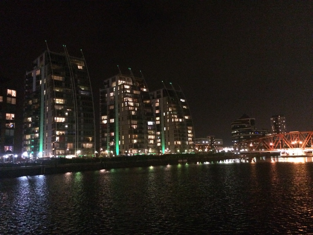
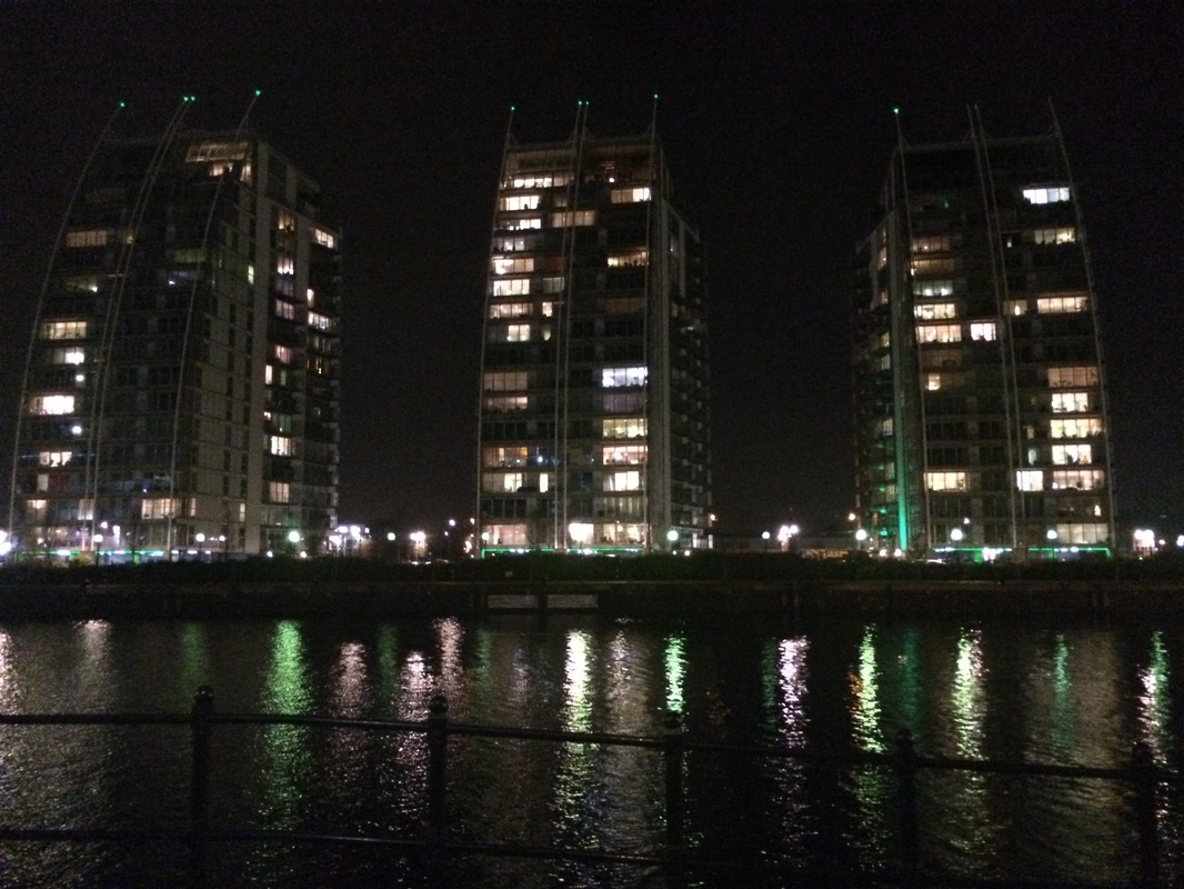
This is a the replicate of the picture Steve Mayes did but with my own ouch on it. I wanted to capture the building from a different angel to my artist so I stood near t he bank instead of facing directly forward to the buildings. I also took it in the dark so I can get the lights reflecting off the water and the lit up rooms in the apartments in contrast with the black sky.
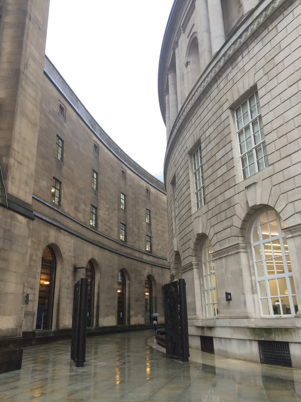
architecture...


stupidity...
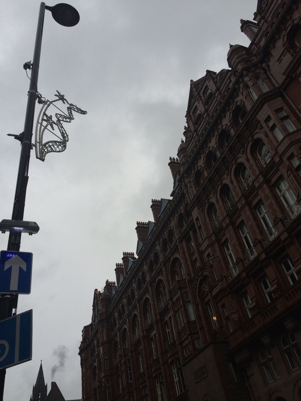
I feel like this is one of my worst pictures from the shoot as the aperture is not correct and the focus point was meant to be on the lamppost but ended up being the awful cloudy sky. It also does not capture any of the architecture of the hotel.
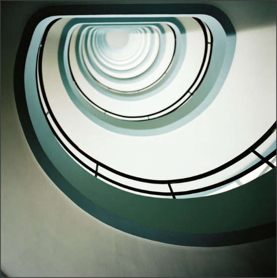
genius...
I really like this picture as I feel like it captures architecture really well as you can see the curve in the building which shows the flow of the structure. It gives the feeling of open space and it has a large depth of field so everything is in focus. It has the right aperture so it is not under or over exposed. I also like the water on the ground which reflects the light from the light in the building.
its beginning to look a lot like Christmas...


genius...
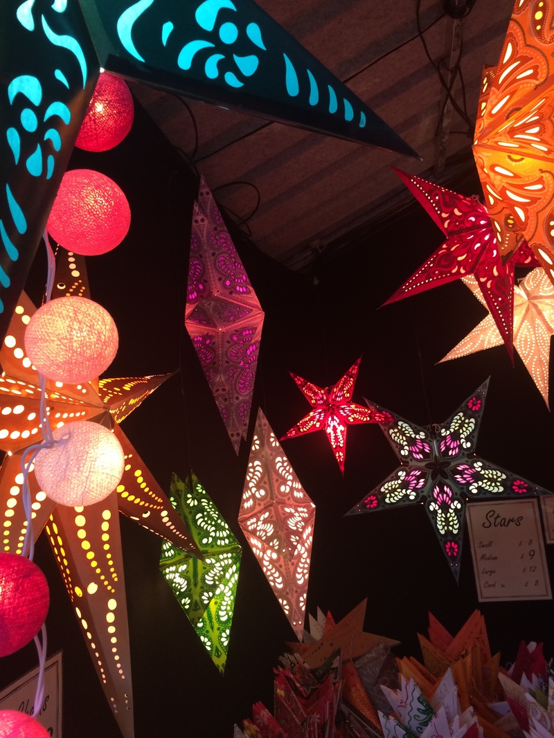
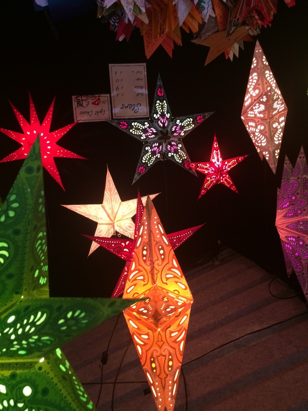
I really like this picture and how it captures the light in contrast to the darkness. I also like how the picture has a high depth of field so all the fairy lights are in focus.

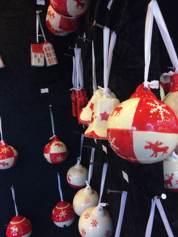
I really like this picture because of how the snow complements the snow man. It has a small depth of field so only the large snowman is in focus. I think it captures the Christmas markets really well as it is about the stalls and spreading the Christmas joy.
splash a b it of green..


genius...
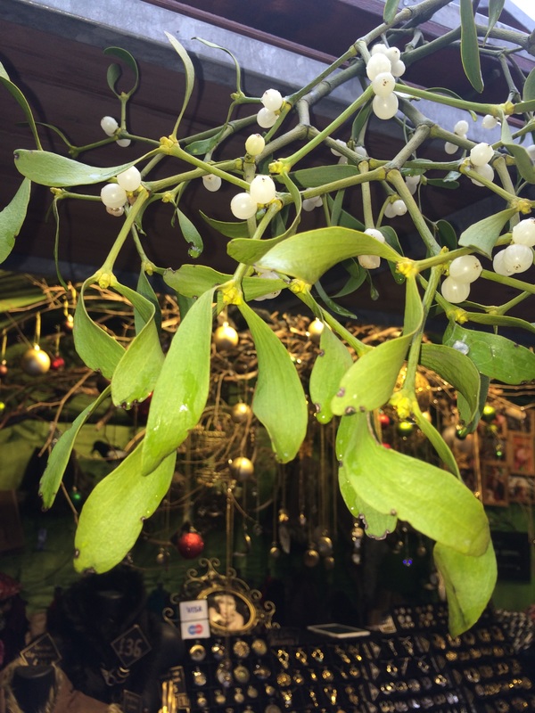
I really like this picture because of the angle and its focus point. It focuses on the mistletoe and because its depth of field is really small. It makes the background of the stall blurred as it is out of focus. I also think that the idea of mistletoe is very closely liked to Christmas and its GREEN!
detailing is the key...


genius...

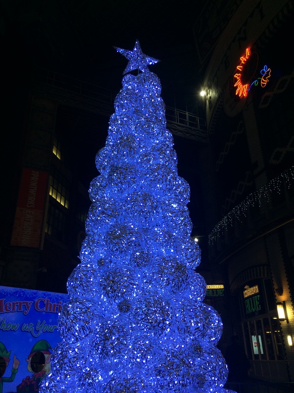
I really like this picture because of how the light of the Christmas tree looks on the camera. It make it look like it is glowing and as it had a high depth of field everything I in focus so it really catches the viewers eye as it is in contrast with the dark background behind it.
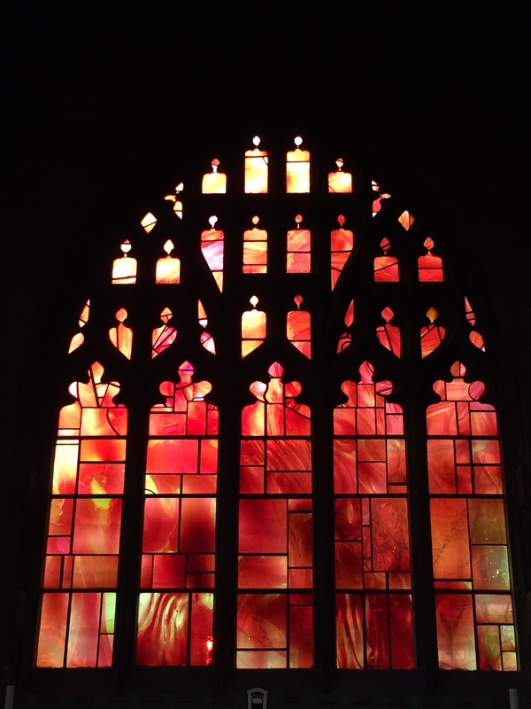
I really like this picture because of how the light is captured in the stained glass. I also really like how you can see all the little details as everything is in focus. I took the picture on a low aperture so you can really see a contrast in colour and the shade
.
time never stops for anyone..


genius...
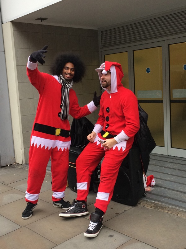
I really liked this picture and wanted to edit it using an app on my mobile.

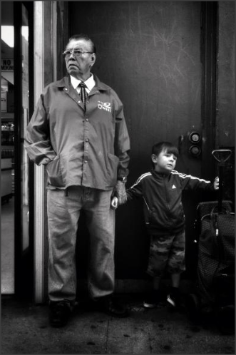
This is defiantly one of my favourite photos as I really like how the colour red contrasts with the black and white as they are opposite colours on a colour wheel. The two guys are both in focus but only one is paying attention to the camera. I think it looks a lot better with the effect from using the app as it allowed me to pic out the parts of the colour red I wanted.
best pictures from the markets...


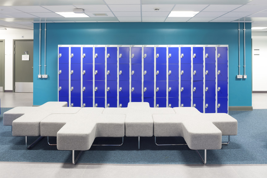
quick lockers...
This is a picture that the photographer took and I wanted to try and replicate it.
|
|
|
The picture on the left is the picture that Steve Mayes took and the picture on the right is the picture that I took. I used a different changing rooms and captured the picture of the blue lockers. They both look very similar as I really wanted to work in the style of him and as I used him as my inspiration so I started to think like him whilst taking the photograph. The focus point on both of the pictures is the lockers and it has a large depth of field so everything is in focus.
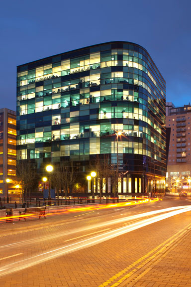
the amazing media city


bit different...

|
|
On the left is a photo that I took on my phone at night in front of the same building that Steve Mayes used. They are both similar and I wanted to work in the style of the artist. I really how the curve in the building is shown and how close my picture is to Steve's. It has a large depth of field so everything is in focus and you can see the details of the road and the building clearly.
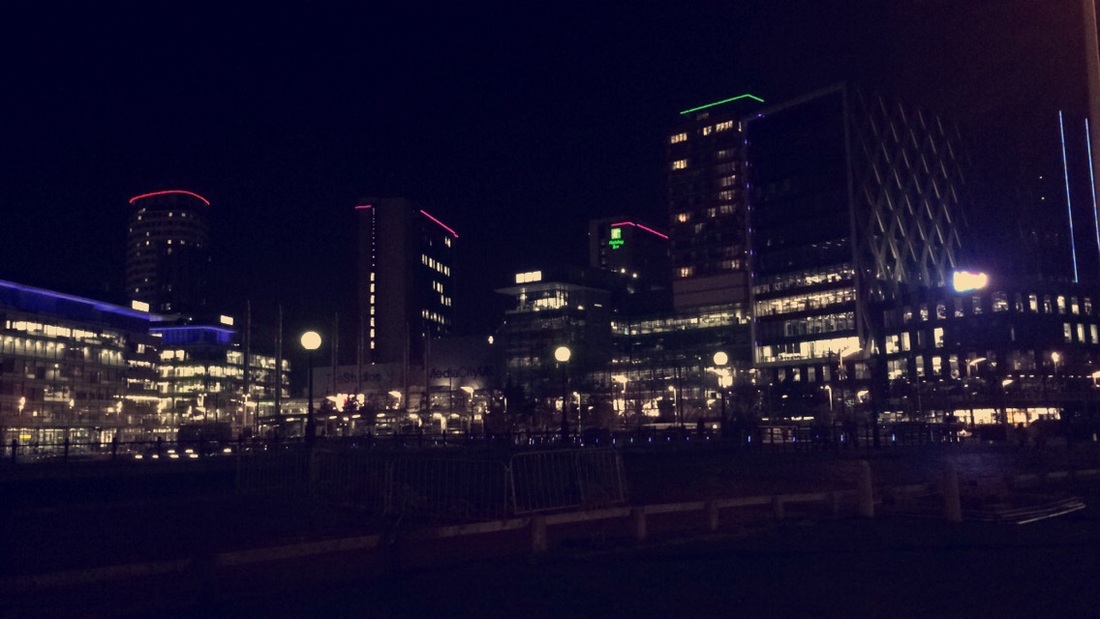
This is my final picture on mobile photography and it is a picture of Media City at night. I really like how all the lights of the buildings stand out in contrast to the dark sky in the background. I have really enjoyed doing mobile photography because I feel like you can always capture a beautiful moment at any time like this on at a night in Media City.
