weird and wonderful...
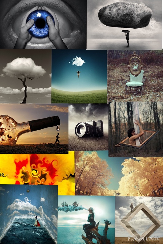
This project is about thinking outside of the box. They are all pictures which make you have to look twice before you understand it or it confuses you even more. All the picture are almost supernatural and very uncommon and it is what make them special and unique in their own way. Most of them have been edited and have been added filters using Photoshop or any other editing apps/websites. Below is a mood board of the style of pictures I want to take myself.
.
surrealism...
Surrealism photography is the photography of imagination, visions, dreams and its free from control. It was formed in the twentieth century and has come a long way since then as the ideas have developed more and now we have the technology to create almost anything using Photoshop and other editing Apps. I picked this topic because I found it most interesting as each picture is different to the other and it changes your perspective of the picture and what's going on in it a few times.
erik Johansson...
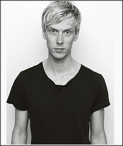
Erik Johansson is a surrealism photographer. He has taken many pictures and always thinks outside the box with all of them. In his videos he explains how to take pictures like these by taking two pictures and making sure they have the same lighting and making them seamless.


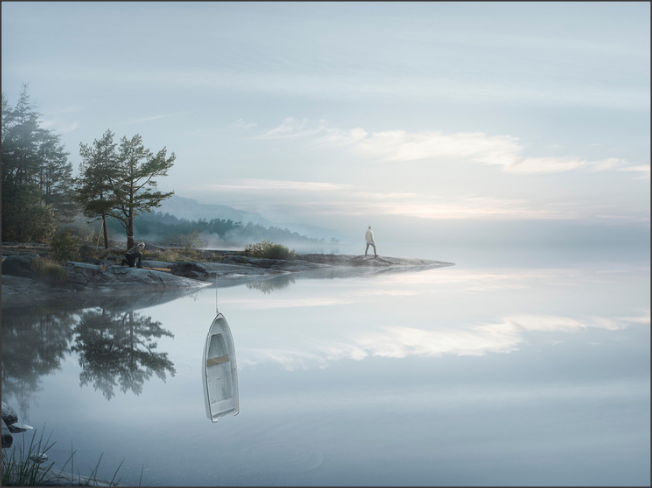
I really like this picture and how it uses the water to divisive the viewer and he uses the reflection of the water to make it look surreal. I really like how everything is in focus which means that is has a high depth of field. I also like how most of the picture is one colour which is almost a grayish blue. It makes him look lonely as the connotations to the colour blue is depressed and loneliness.
ronen goldman...


I really like the style of Ronen Goldman as he makes ordinary objects look surreal. I think the lightning used in his pictures are really good and complement the picture a lot, as he might change the depth of field or aperture or maybe even the white balance.
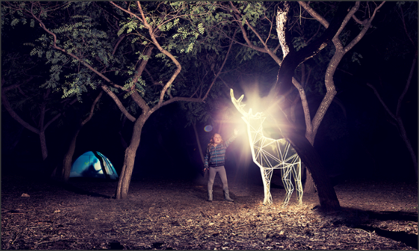
I really like this picture because the lighting coming from the reindeer is very effective. It catches my attention immediately. The little girl reaching for it also has an impact and reminds me of my childhood and how children want to touch everything. Everything is in focus and has a large depth of field so you can see the different parts of the image.
MICHAEL BOSANKO
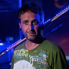
Michael Bosanko is a light photographer who inspires me a lot. I feel like his ideas are very creative and thoughtful. Light photography is a technique which is made by moving a hand held light while taking a long exposure photograph. By this you can create amazing colourful pictures . Light painting started in 1889 and you can use a variety of different lights as they will all give different effects. So a bright white light will look very different to a multi coloured flashing light. This gives us a huge range to work with an create outstanding pictures. You will need a tripod or a flat surface to place the camera because it is essential that the camera dose not move, if it dose then your picture will come out very different to what was planned because the photo will also take the movement of the camera into the picture along with the movement of the light. You will essentially need a dark room other wise all of the pictures will just be full of light. So I decided to try for myself and if is harder than it looks. We had fifteen seconds to create a picture either of words or meaningful. This was difficult as I soon realized I had to write backwards for it to show on the photograph, but after struggling for a good fifteen minutes I finally got the hang of it and mastered the skill. I would love to do it again as I think it is a really creative way of taking photographs and you can show real creativity through it. Maybe this time I would challenge myself further by trying to draw something more complicated but having a simple yet effective meaning. Here is some of his work.

I like this picture because it reminds me of pac man and it uses a lot of bright colours. I like how it give a clear message that it is based upon packman and I can't imagine the time and effort need to make this. It is focused on the whole picture so you have got quite a lot to look at but it looks majestically and breath taking. I like his photography as is shows a clear message through it by using bold colours and bright lights which are total opposites on the colour wheel. A lot of his work involves humour and the great use of shadow to create impact on the viewer.
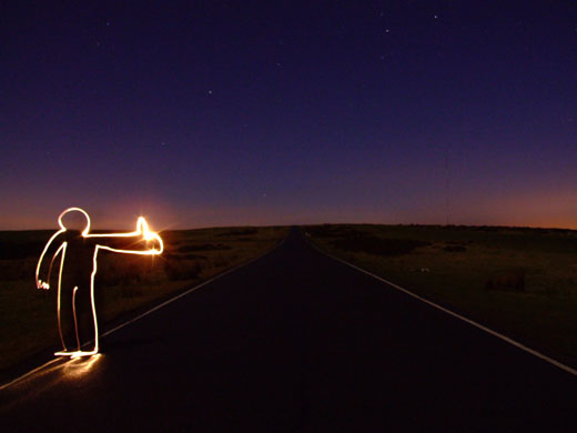
I really like this picture because it shows a person asking for a lift by reaching out and putting the thumbs up. I think he has created this by using a person standing there first and drawing an outline of the person and the getting him to step out of it so in the final image it looks like the light is just there. I also like the sunset or sunrise in the background which has and powerful inmapct of the viewer as it shows that is it late and not that many people are awake at that time of day and it will be hard for him to get a person to give him a lift to the destination he wants tot go to.
my turn.
lights out.


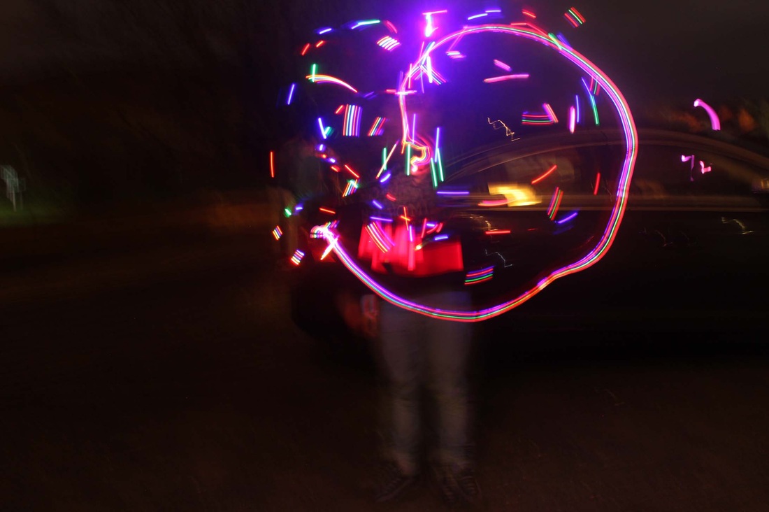
This picture shows how different types of light effect the photograph. If you use a flash light and move it very fast there will be gaps in the line of light. You can also use multicoloured light to add different colours in the photograph.
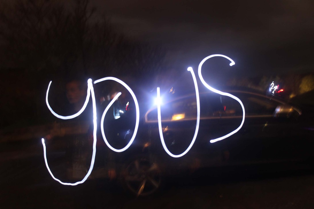
I really like this picture even though it is meant to spell "yours" instead of "yous". It is a lot harder that it looks as you need to write backwards and the letters need to be the other way around. But I really like how the white light stand out as the background is dark.
ben heine...
Ben Henie is an artist photographer that takes a picture and put a sketch of a cartoon or image in pencil and puts it over his initial picture. It makes the picture look a lot more interesting and because it’s so different it makes it even more eye-catching. Below are some of his pictures and I really like them as they give two dimensions of the same picture and you can almost imagine what was there in the first place. I also like how detailed the cartoon drawings are and it gives the picture humour as it is not what we usually see on an everyday basis. I really like his style pf photography and have picked his favourite picture of mine out below and have said why I liked it so much.


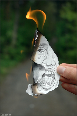
I really like this picture as it uses something real life like fire and something fake which is the cartoon. It shows that the person in the cartoon is scared and is almost getting burnt by the real fire. I really like the flame in the picture as it looks very realistic and almost as a perfect flame. I also like the expression on the peace of papers face as it shows clear emotion of fear even though it is not real. I think the photograph has a really creative effect as it is mixing something real and artificial making it surreal which is the topic I have chosen.
I'M CRACKING A SWEAT.
First I took pictures of a stick man 'carrying' a pencil and drew a sun.


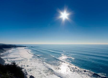
I then needed a image of a sun which I could use in the picture.
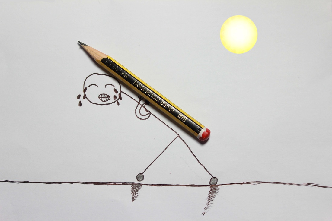
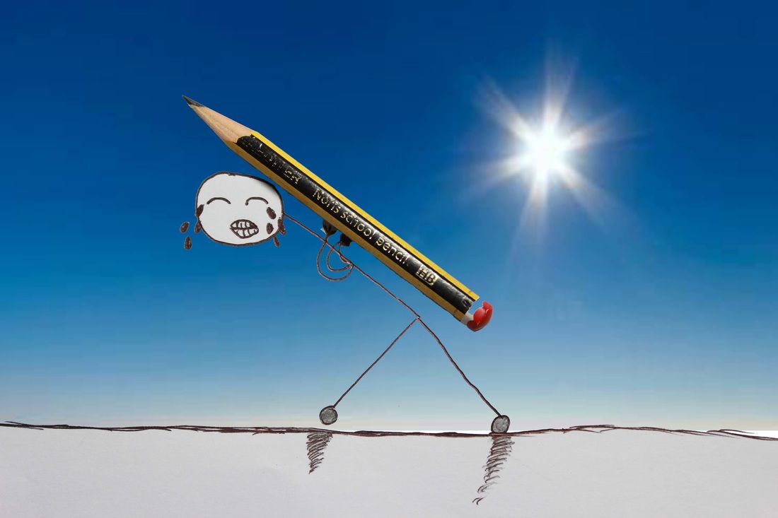
At the end I took the background of the sun from the other picture and used it as the background for my stick man with the help of Photoshop. I makes it have a sunset effect and it makes it look like the stick man is showing emotion as he is crying in pain. I has a high depth of field so everything is in focus as the focus point is on the stick man.
hob nob...


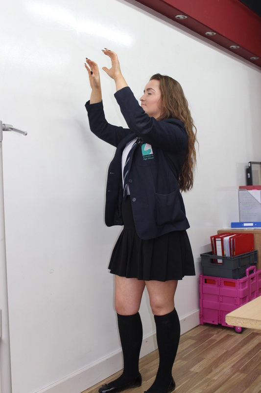
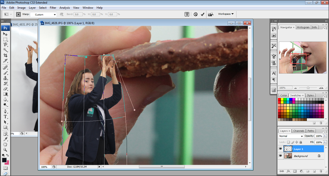
I then took a full body picture of Jade and made her put her hands up to make it look like she is grabbing onto the biscuit.


Using Photoshop...
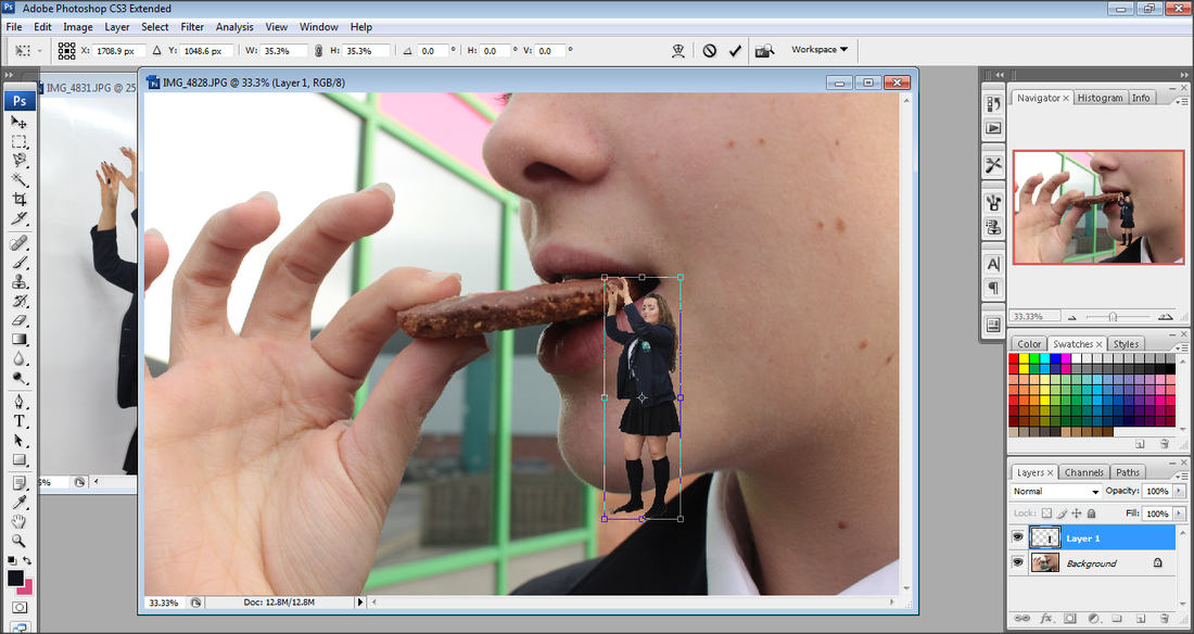
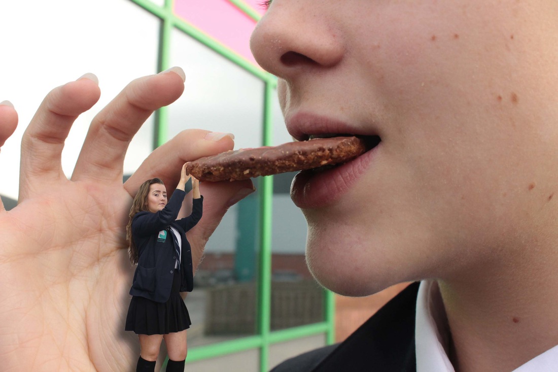
This is my finished peace after all the editing on Photoshop. I have switched her body position and added shadow to make it much more realistic. I think it shows that she is hanging off the hob non which is about to get eaten. I think the shadow really makes a huge difference as it really adds to the effect of her hanging from the biscuit. Maybe her expression could be more realistic of being scared to get eaten but I think it still represents surrealism and you will not get miniature people hanging off biscuits. The picture has a medium depth of field and it focus on everything except the mirror in the background which is not needed so the viewer's attention directly goes on the biscuit.
autumn.
I wanted recreate a tree in a sunset so it gave it a autumn winter effect. First I had to draw a tree with a pencil and paper. Underneath are the following pictures of the steps of my gradual improvement of drawing my tree.


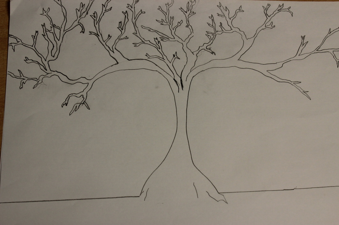
This is my end drawing of my tree. I then painted a sunset using red and yellow paint and used extra lighting to take the final picture using a high depth of field and on auto white balance.


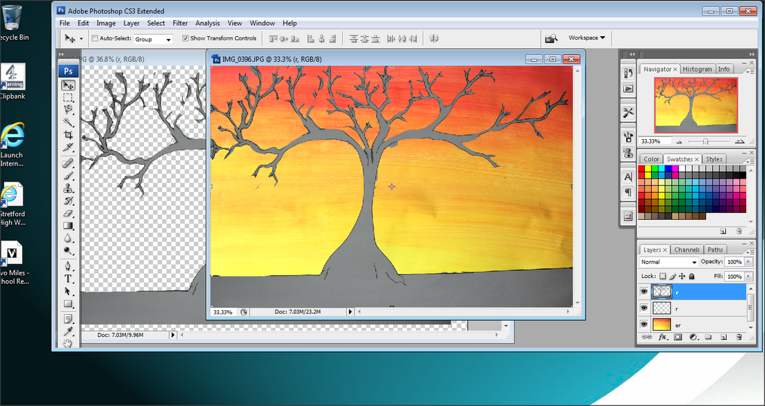
I then used Photoshop to crop the picture of the tree and place it on the sunset and using it as a background. I then took pictures of my friends ( Khole and Jade) leaning on a tree and wanted to crop them into the picture of the sunset.I didnt use jade as her hair was flying out and it was hard for me to crop it specifically.


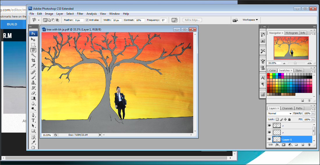
Then I used the magic of Photoshop to put Khloe into the picture.
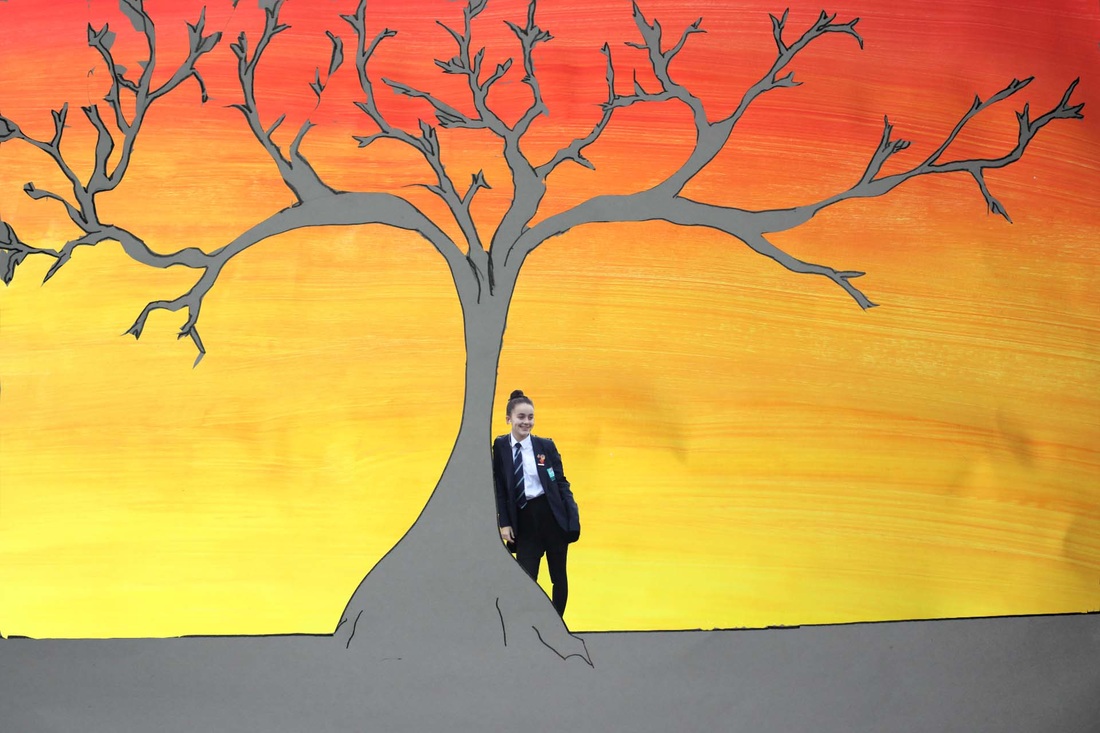
This is my final picture as Khloe is stood behind the tree and looking towards the right. I really like this picture as the lightening is perfect as the aperture is on 0. I also like how everything is in focus as it has a large depth of field. It is a very autumn winter feel to the picture and I think it fits perfectly with the season.
